| Image |
Comment |
| 04/02/2008 12:07:50 AM |
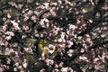
Razor Sharpby KelliComment by Jutilda: ROFL Love the title. You are one of the few who "got" that aspect of it. ;~) |
 Photographer found comment helpful. Photographer found comment helpful. |
| 04/01/2008 08:23:11 PM |
|
| Photographer found comment helpful. |
| 04/01/2008 04:05:44 PM |
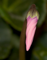
Tulipby KelliComment by glad2badad: I've spent most of my time trying to figure out your border...doesn't feel right IMO. |
| Photographer found comment helpful. |
| 04/01/2008 09:34:07 AM |
|
| Photographer found comment helpful. |
| 03/31/2008 05:56:48 PM |
Tulipby KelliComment by bvlindalou: love love your pic......imo, your border is a little to heavy for the pic |
| Photographer found comment helpful. |
| 03/31/2008 09:31:38 AM |
|
| Photographer found comment helpful. |
| 03/31/2008 08:18:58 AM |
|
| Photographer found comment helpful. |
| 03/29/2008 03:29:17 PM |
Whistler's Grandmotherby KelliComment by codys: I like portraits of old people. There is always so much character in their faces. I like the expression here, nice pose.
Here are a couple of things I would suggest:
• Use some side lighting to add depth. If you don't have lights, use a window. Then use your shutter speed to control the strength of the available light.
• Have your subject stand farther from the background and select a larger aperture. This will create a more narrow depth of field and "blur out" distracting background elements like wrinkles/folds in your backdrop. |
| Photographer found comment helpful. |
| 03/29/2008 12:57:58 PM |
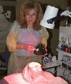
Getting Pinkby KelliComment by Quasimojo: p.s. I had a quick go:
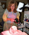
- USM @ 10,60,0
- selective colour adjustment on cyan of Red to bring out the pink glow on the beauty therapist
- bit of levels/contrast
I'm not sure it's a great improvement but the colours definitely pop more.
N |
| Photographer found comment helpful. |
| 03/29/2008 12:49:40 PM |
Getting Pinkby KelliComment by Quasimojo: I didn't vote either but I'll try to give some constructive criticism. Personally I like the composition, especially as an EP. It's clearly a somewhat difficult exposure, limited by the highlights on the client's face...and with Basic ruleset means you're limited in what you can do to address it. I think the main reason for not appealing to voters isn't the composition but the processing (or lack of) but in the colours/sharpness/contrast/tones. As it is, it has a bit of a snapshot feel to it purely because of the colouring I think. Maybe try a small USM (10, 60, 0 is my standard output settings) and play with both levels/curves and selective colour to try to make the image 'pop' a little more. Also worth playing with the aperture to find the right level of ambient and flash light in the scene (if you have the time). You can control the amount of flash or ambient light by varying aperture and in this photo might have given you some extra options to isolate your subjects from the background.
In any case I think this is a better photograph than the score and place suggest, but it does seem that bright colours appeal to DPCers, and muted/washed out colours tend to turn them off.
Hope this helps, N |
| Photographer found comment helpful. |
Home -
Challenges -
Community -
League -
Photos -
Cameras -
Lenses -
Learn -
Help -
Terms of Use -
Privacy -
Top ^
DPChallenge, and website content and design, Copyright © 2001-2026 Challenging Technologies, LLC.
All digital photo copyrights belong to the photographers and may not be used without permission.
Current Server Time: 07/28/2026 07:13:58 AM EDT.