| Image |
Comment |
| 02/27/2009 11:34:02 AM |
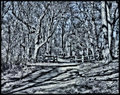
Februaryby KelliComment by digitalphoto: Wow! I love this photograph. I love the B&W. I would have loved to see it in color as well. |
 Photographer found comment helpful. Photographer found comment helpful. |
| 02/27/2009 12:42:10 AM |
Februaryby KelliComment by DigiFotoBuddy: Too busy a picture. Shadows, trees everything is too cluttered. May be color version would have been little better to differentiate objeccts. One of my low score, sorry. |
| Photographer found comment helpful. |
| 02/26/2009 08:45:55 PM |
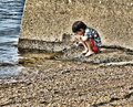
Youthby KelliComment by Quigley: Hello Kelli, sorry to take so long to get to you for my commenting but better late then never.
I like the eyes and the angle of the shot. I wonder if you processed this in B&W if it would have been more of a hit with the voters?
There is a definite snap shot feel to this photo and I wonder if that was your intention?
All the best to you and yours.
MAX! |
| Photographer found comment helpful. |
| 02/26/2009 07:04:45 PM |
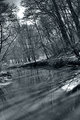
Februaryby KelliComment by annig: very glaring and over sharpened on my monitor. would have been a nicer touch to go soft IMO, espec the way the shadow "travels" the path |
| Photographer found comment helpful. |
| 02/26/2009 09:00:20 AM |
Februaryby KelliComment by TrollMan: It almost looks messy to me due to all the detail... maybe the mid-tone contrast has been boosted a little too much. Otherwise a good scene. |
| Photographer found comment helpful. |
| 02/25/2009 07:14:30 AM |
Sunshine & Shadowsby KelliComment by NikonJeb: Kelli, I basically liked this shot, but it lacked that "Grab me" thing that I'm looking for in a B&W. Can you amp it up at all with contrast? Nice scene.... |
| Photographer found comment helpful. |
| 02/24/2009 05:16:48 PM |
|
| Photographer found comment helpful. |
| 02/24/2009 11:20:38 AM |
|
| Photographer found comment helpful. |
| 02/23/2009 11:37:17 PM |
Number 7 - Exploring the river bankby KelliComment by Neil: What a great shot. I like the crop and scene. I like the textures too, of course, but I think Topaz has overemphasized the rocks. I would suggest trying to darken the BG and bring him out with a bit of vignetting, and burning of highlights. To illustrate (and confirm) what I'd suggest--I hope it's ok--I downloaded this version and did a little playing in PS.
I toned down colors a bit by copying the layer, blurring it significantly, and then setting the mode of the layer to color. I was intending to reduce color noise in the rocks by doing that, but the toned down look really worked for me. Then I vignetted, with the focal point a small area around him; then I flattened and burned highlights around the edges, to darken even more.
Here's what you get when you play in such a manner. Just to give you some ideas. Hopefully, I didn't overstep my bounds by trying this, it's in my workshop for now; if I did, let me know and I'll remove it:

|
| Photographer found comment helpful. |
| 02/23/2009 11:24:22 PM |
|
| Photographer found comment helpful. |
Home -
Challenges -
Community -
League -
Photos -
Cameras -
Lenses -
Learn -
Help -
Terms of Use -
Privacy -
Top ^
DPChallenge, and website content and design, Copyright © 2001-2026 Challenging Technologies, LLC.
All digital photo copyrights belong to the photographers and may not be used without permission.
Current Server Time: 06/18/2026 09:56:08 PM EDT.