| Image |
Comment |
| 06/03/2006 05:16:53 AM |
A child's crowning achievementby KelliComment by chalice: The focus is good, as are the colors of the medal. There are background shadows that distract from the subject. I didn't vote in this challenge but probably would have agreed with the majority. The photo lacks any "wow" factor, but instead looks like a stock photo shot.
I just noticed the title. Given that, perhaps the child should be in the picture too. I'm sure his/her grin would have been worth a bump in the score. |
 Photographer found comment helpful. Photographer found comment helpful. |
| 06/02/2006 07:40:18 PM |
|
| Photographer found comment helpful. |
| 06/01/2006 10:52:53 PM |
A child's crowning achievementby KelliComment by ericwoo: --Trading Post Comment--
Camera Work/Technical: Amazing focus! The detail that you captured throughout the image is very nice, and works very well to draw the viewer's eye around the subject.
Lighting: The lighting is a bit harsh, but not all bad. The gradient that you created from top to bottom provides some interest, but I think that it is just a touch too harsh, mostly on the top. The top area looks to be a little overexposed.
Composition/Content: Interesting, but I think it would have benefited if it were around the kid's neck with a big smile and funky pose.
My Opinion: You met the challenge, and I think that your score should have been a bit better based on the technical aspects alone. The composition could have been better, but I don't think that it's a sub-5 capture.
Eric
|
| Photographer found comment helpful. |
| 06/01/2006 06:10:44 AM |
Pottedby KelliComment by kirsty_mcn: Sorry to get to you so late,
I'm not sure how this works as a Still life - its not an arranged composition (or if it is, you can't tell from the crop). Having said that, its a good floral, even with the difficult exposure conditions - with such a bright background, you've done well to expose the flowers well.
I think all it boils down to is that the majority of voters will have not considered it a still life. Sorry, but I don't really have anything to add to what everyone else has been saying |
| Photographer found comment helpful. |
| 05/31/2006 11:33:43 PM |
A child's crowning achievementby KelliComment by Melethia: Trading Post comment
Definitely meets the challenge! I think I'd like it a little less "middle" for some reason, or maybe kind of "hanging instead of what looks be lying rather flat. Colors are good, focus and sharpness are excellent. A bit of a color cast on the background - not sure if that can be removed using levels, but might be worth a try. Most importantly, though, tell your son congrats! |
| Photographer found comment helpful. |
| 05/31/2006 11:25:42 PM |
|
| Photographer found comment helpful. |
| 05/31/2006 05:30:45 PM |
|
| Photographer found comment helpful. |
| 05/31/2006 01:58:02 PM |
A child's crowning achievementby KelliComment by DanSig: [[trading post]]
this image is unfortunately not very good, when shooting on a white background you need multiple lights to keep the shadows away, and that color smear on the background is really bad.
to get the background whiter in basic editing you can use selective color in photoshop and select the white channel, then turn the black down until the background is bright white.
but to get a higher score in this challenge I think the medallion has to be on the winner, to show a child as a winner always scores some points :) |
| Photographer found comment helpful. |
| 05/31/2006 01:47:08 PM |
A child's crowning achievementby KelliComment by DrAchoo: I'll speak to the technical first. Focus is excellent. The image is nice and sharp. There are lighting issues. The top is too white while the bottom has shadow with color casts. The composition is static and centered. That isn't completely bad because a stock photo of a medal would probably naturally be centered.
A big limiting factor is the subject holds a lot more interest for you than the casual viewer. The title, I think, saves it, but not everybody reads the title. It's cute to thing how such a cheap trinket would mean so much to a child, but that is only conveyed with the title, not the picture. |
| Photographer found comment helpful. |
| 05/31/2006 11:14:33 AM |
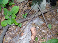
deaddoll.jpgby KelliComment by Kelli: Originally posted by kenskid:
Are you kidding...you really found this like this? |
Yep! Scared the crap out me too! |
Home -
Challenges -
Community -
League -
Photos -
Cameras -
Lenses -
Learn -
Help -
Terms of Use -
Privacy -
Top ^
DPChallenge, and website content and design, Copyright © 2001-2026 Challenging Technologies, LLC.
All digital photo copyrights belong to the photographers and may not be used without permission.
Current Server Time: 06/23/2026 02:59:23 AM EDT.