| Image |
Comment |
| 12/13/2005 02:53:15 PM |
|
 Photographer found comment helpful. Photographer found comment helpful. |
| 12/13/2005 09:05:56 AM |
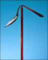
Extinguishing by soupComment by RichSeal: Great shot - my fav of the challenge. Love the simplicity and the nice reflection created. 10. |
| Photographer found comment helpful. |
| 12/13/2005 08:53:50 AM |
Extinguishingby soupComment by jpdeloof: very beautiful approach of the flame which éteind slowly, good composition and beautiful play of light. |
| Photographer found comment helpful. |
| 12/13/2005 08:29:50 AM |
|
| Photographer found comment helpful. |
| 12/13/2005 02:52:16 AM |
|
| Photographer found comment helpful. |
| 12/12/2005 11:42:31 PM |
|
| Photographer found comment helpful. |
| 12/12/2005 10:44:18 PM |
|
| Photographer found comment helpful. |
| 12/12/2005 10:25:31 PM |
Extinguishingby soupComment by Rgarcia: Wow!! I like this shot in so many ways!! Composition, balance between the dark and light sides, the reflection, the texture, the colors...
I hope this shot will be among the top 3!!! |
| Photographer found comment helpful. |
| 12/12/2005 10:22:24 PM |
Needle and the Damage Doneby soupComment by saiphfire: Hey, I didn't vote in this challenge so I'm coming to leave you a message now. By the way, it also irritates me when a picture of mine does worse than I expected and no one leaves me comments. COMMENTS, PEOPLE.
I had never heard the lyrics quoted in the title before today and when I saw the shot my first impression was that the white was a mistake and that the "damage done" referred to the bending of the spoon. In other words, I bet a lot of people didn't even get the reference. It wasn't until I read in your description that it was a song lyric that I realized the white represented heroin (and, of course, we don't get the description when voting).
Even if I had understood the reference, while I like the symbolism of the white powder, I feel that it detracts from the beauty of the image. For me it ruins the pretty contrast of the red against the blue. Without the white the picture is composed only of two bright primary colors (blue/red). The white muddles that starkness, imo.
If I had voted on the contest and had not understood the reference of your title, I would have given you a 5. If I had understood I would have given you a 7. |
| Photographer found comment helpful. |
| 12/12/2005 09:23:46 PM |
|
| Photographer found comment helpful. |
Home -
Challenges -
Community -
League -
Photos -
Cameras -
Lenses -
Learn -
Help -
Terms of Use -
Privacy -
Top ^
DPChallenge, and website content and design, Copyright © 2001-2026 Challenging Technologies, LLC.
All digital photo copyrights belong to the photographers and may not be used without permission.
Current Server Time: 07/25/2026 10:25:26 PM EDT.