viva espana, olé!!!by
cyparisComment by NiallOTuama: Greetings from the critique club!
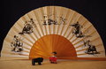
The first thing that strikes me about this image is that when you look at it first it doesn't look horozontal, even though it is. It looks slightly skewed to the left. This isn't to do with the cropping and tilt, it's to do with the differences in thickness of the folds of the fan -- on the left they're closer together giving the illusion of the misalignment. It might be down to the shadows that are cast by the lighting of the shot -- they look longer on the left, giving the illusion of depth on that side too.
The second thing that strikes me about it is that the objects look very small. Moving them closer might introduce some more difficulties, however. You'd probably want both sets of objects (fan and figures) to be in focus, so to achieve this you'd want to narrow your aperture (you shot at F/4, to close change to F/22 or narrower, perhaps). In terms of how the composition of the objects might change in light of moving the objects closer... it might add some more depth to the shot if the bull was positioned close to the camera pointed to run towards the bull fighter who was maybe deeper in the shot. Or the other way around with the bull running towards the viewer.
Another thing that struck me was that the picture doesn't really appear to be nice and crisp in focus throughout. If it's not down to the focus on the camera it could be down to the quality of the image that you exported for the challenge. Make sure to check your ppi and to shoot at the highest quality you can.
I like the colours a lot in this. You did a nice job with the lighting from the left to right in the table with the colour gradient. I think the table matches the fan, and the black background matches the black bulls in the fan. Good set up in that regard.
In terms of post processing I think you could do a little bit to this. Something I noticed was that the black at the top doesn't appear to be as dark as it could. Enhancing the blacks and the lights could also bring out the bulls on the fan more, fully blacken the background, and also give more of a suggestion of a sunrise at the table.
One last general suggestion is that it might be worth seeing what people on the forum think of the images before submitting them. On the forums there's a
thread where users may ask the advice of a more experienced member on their submissions before entering them. That way you get some critique before the competition and you might learn to look out for things before submitting. If you're interested, reply to the thread and ask for a mentor for upcoming challenges. Alternatively you could request one-on-one mentoring on submissions to previous competitions. It'll probably require reshooting the scene, but that mightn't be a bad thing either.
I actually liked this image. I think with a little bit more work it could have done a little better than it did!
Hope this helped.