| Image |
Comment |
| 05/24/2010 01:14:25 PM |
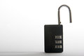
Master Lockby injenn00Comment by Ja-9: some fill light and a bit of a noise reducing would have gone a long way IMO |
| 05/19/2010 09:53:25 PM |
Master Lockby injenn00Comment by disassociation: this seems a little dark for a product/advertising shot. i feel as though you would have been more successful with a different lighting set up. |
| 05/19/2010 05:36:59 AM |
Master Lockby injenn00Comment by MCPixel: There isnt enough detail in the actual lock, looks a bit washed out. If your lock was sharper with more light on it, it would have done better. |
| 05/19/2010 04:19:18 AM |
Master Lockby injenn00Comment by mrbig65: ahh,,,, not very interesting one,, focus is caput,,,, background is not good for this shot,,,,,,,,,,, |
Home -
Challenges -
Community -
League -
Photos -
Cameras -
Lenses -
Learn -
Help -
Terms of Use -
Privacy -
Top ^
DPChallenge, and website content and design, Copyright © 2001-2026 Challenging Technologies, LLC.
All digital photo copyrights belong to the photographers and may not be used without permission.
Current Server Time: 07/02/2026 11:23:22 PM EDT.