| Image |
Comment |
| 01/26/2004 03:27:20 AM |
|
 Photographer found comment helpful. Photographer found comment helpful. |
| 01/26/2004 01:00:45 AM |
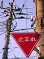
Tokyo-styleby ccjpComment by Anmitsu: "TOMARE"... instead they should write "SUTOPPU." High up on the electric pole, a sign buried in millions of cables and wires. Very Tokyo style! I think this image captures the whole essence of Japanese culture. |
| Photographer found comment helpful. |
| 01/25/2004 06:51:30 AM |
Tokyo-styleby ccjpComment by luismorais: This picture is so cool!!! Blody hell, it is the best composition I have seen so far, well done! My best vote for you too:10!!! |
| Photographer found comment helpful. |
| 01/22/2004 06:01:52 PM |
|
| Photographer found comment helpful. |
| 01/22/2004 03:10:25 PM |
|
| Photographer found comment helpful. |
| 01/21/2004 01:10:54 PM |
Tokyo-styleby ccjpComment by barryg: I would have l see a little sharper definition between wires and sky. |
| 01/21/2004 09:33:18 AM |
Tokyo-styleby ccjpComment by Shannon: The power lines distract from the sign to much, maybe a different sign or a different angle would have worked better. |
| 01/21/2004 02:18:30 AM |
|
| 10/15/2003 03:42:47 AM |
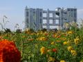
Taking overby ccjpComment by ccjp: Thanks to all the persons who dropped a comment! Just a few notes. This photograph is meant as a counterpoint between urban structures and natural structures. Thus I wanted the image to convey this idea of each party trying to "take over" the other. Hence come both the large amount of foreground and the low perspective: I wanted the flowers to look as they were "competing" with the building. The out-of-focus flower at the bottom left is also there on purpose: I chose a round one because I wanted it to contrast with the steel sphere of the building. I wanted it to be out of focus because otherwise it would have taken too much of the viewer's attention. Most importantly, I wanted the viewer to feel the presence of the flower when watching the building, to be distracted by it - and yet have his eyes slip off it, brought away by the sharper focus of the rest. I am actually glad that so many people complained about the flower being "distracting": it is designed to be so. I wanted the flower and the building to actually compete, as visual elements of the image, for the attention of the viewer. This is meant to be a dissonance. Here you can see an outtake for the same subject: more building, less foreground, higher perspective, no flower - it's plain boring imho. ;) Message edited by author 2003-10-15 03:45:19. |
| 10/14/2003 02:06:45 PM |
|
| Photographer found comment helpful. |
Home -
Challenges -
Community -
League -
Photos -
Cameras -
Lenses -
Learn -
Help -
Terms of Use -
Privacy -
Top ^
DPChallenge, and website content and design, Copyright © 2001-2026 Challenging Technologies, LLC.
All digital photo copyrights belong to the photographers and may not be used without permission.
Current Server Time: 07/16/2026 06:45:45 PM EDT.