| Image |
Comment |
| 05/07/2010 12:03:52 AM |
|
 Photographer found comment helpful. Photographer found comment helpful. |
| 05/06/2010 11:11:18 PM |
|
| 05/06/2010 09:45:31 PM |
|
| 05/06/2010 08:30:12 PM |
|
| 05/05/2010 08:33:59 AM |
|
| 05/05/2010 12:38:36 AM |
|
| 04/28/2010 11:40:54 PM |
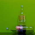
More for me!by MaartenvanastComment by blad: if this is about light, shape,space and color... you win. if there is some meaning to it... you lose. 7 |
| Photographer found comment helpful. |
| 04/28/2010 06:22:31 PM |
More for me!by MaartenvanastComment by nmrmak: Great wall colour and just the right exposure, the label on the horizontal bottle draws attention to it as it looks much more realistic than the rest of the two bottles. For some reason the composition doesn't work great for me, but i really have no idea why. Also, i don't understand the connection between the title and what's on the photo. Good luck :) |
| Photographer found comment helpful. |
| 04/27/2010 11:58:17 PM |
|
| 04/25/2010 12:34:03 AM |
|
| Photographer found comment helpful. |
Home -
Challenges -
Community -
League -
Photos -
Cameras -
Lenses -
Learn -
Help -
Terms of Use -
Privacy -
Top ^
DPChallenge, and website content and design, Copyright © 2001-2026 Challenging Technologies, LLC.
All digital photo copyrights belong to the photographers and may not be used without permission.
Current Server Time: 07/15/2026 04:28:10 PM EDT.