| Image |
Comment |
| 10/16/2003 12:26:08 PM |
|
 Photographer found comment helpful. Photographer found comment helpful. |
| 10/16/2003 09:19:46 AM |
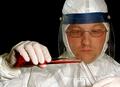
Dangerous Workby gstrotmannComment by dsa157: perfectly captures the spirit of the challenge and is well composed and interesting. The Hazmat suit and test tubes make it very apparent that you are observing a scientist at work. His eyes lead you right to the point at which he is concentrating - where the test tubes meet. I like the positioning within the frame. Lighting and exposure and top notch. my favorite of the group. 9 |
| Photographer found comment helpful. |
| 10/15/2003 09:02:22 PM |
Dangerous Workby gstrotmannComment by justine: Very nice shot..fantastic for the challenge. Good focus, maybe a wee bit extra light..?white of the suit? Still I like this very much, good going!!! |
| Photographer found comment helpful. |
| 10/15/2003 10:19:17 AM |
|
| Photographer found comment helpful. |
| 10/15/2003 06:14:43 AM |
Dangerous Workby gstrotmannComment by kiwiness: Good photo composition, rule of thirds well adhered to. The white and reds and black background work well together. The mask is a little fogged up, but I guess mine would be too if handling dangerous chemicals - 10. |
| Photographer found comment helpful. |
| 10/14/2003 10:29:04 PM |
|
| Photographer found comment helpful. |
| 10/13/2003 06:24:29 PM |
|
| Photographer found comment helpful. |
| 10/13/2003 02:16:30 PM |
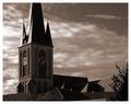
Top of the roofsby gstrotmannComment by ronners: I find your decision to crop off the top of the spire intriguing. It doesn't actually hurt the photo too much, because I know there's a spire there anyway. What it does do, however, is lead the eye out of the shot, which may not have been your original intention.
From a technical perspective, consider NeatImage to reduce the noise in the sky, and maybe a crop to remove the foliage on the right. |
| Photographer found comment helpful. |
| 10/12/2003 05:51:50 PM |
Top of the roofsby gstrotmannComment by Neuferland: The coloring on this photo, I think would have worked better in black and white instead of sepia. The title makes you look for the rooftops but they are not a prominant part of the picture overall, the tower to the left is excellent balance but seems just a bit grainy, which actually works in this shot. |
| Photographer found comment helpful. |
| 10/11/2003 05:44:40 PM |
|
| Photographer found comment helpful. |
Home -
Challenges -
Community -
League -
Photos -
Cameras -
Lenses -
Learn -
Help -
Terms of Use -
Privacy -
Top ^
DPChallenge, and website content and design, Copyright © 2001-2026 Challenging Technologies, LLC.
All digital photo copyrights belong to the photographers and may not be used without permission.
Current Server Time: 07/16/2026 01:38:05 AM EDT.