DPChallenge: A Digital Photography Contest You are not logged in. (log in or register
 
Browse Settings
Currently viewing:
Registered Usermarcoesquivel

Show comments:

Per page:

Order:

Comments:


Comments Received by marcoesquivel
Pages:  
Showing 1 - 10 of ~41
Image Comment
Marfill
03/12/2010 10:43:40 PM
Marfill
by marcoesquivel

Comment by snaffles:
Greetings from the Critique Club!

Interesting image. I imagine the title and elephants have significance for you, but here it is lost on the viewer. Is Marfill an elephant? A location? Is there a story to be told by entitling it Marfill? As they say, a photo is worth a thousand words, so give what you have at your disposal - your elephant statues and studio and LEDs - a story to tell.

Technically, the composition is quite centred and focus appears soft, though I do like the dof and shadows cast by the figures. And as you likely had a tripod for an 8-second capture, why use such a high ISO? Most LEDs, which are popular with those that like painting with light, give off quite good light on their own. I believe an ISO of 200 would have been adequate, and helped cut down on the background light glare.

The only to improve is to keep on shooting, and never be afraid to mess with the settings. Experiment and see what works and what doesn't. But above all, keep shooting!

Feel free to PM me with any questions,

Susan
Marfill
03/08/2010 11:43:55 AM
Marfill
by marcoesquivel

Comment by glad2badad:
Just wanted to say that I really admired your entry. Stunning lighting effect. Would like to know more about your setup if you'd care to share sometime. :-)
Marfill
03/08/2010 03:35:19 AM
Marfill
by marcoesquivel

Comment by Chinarosepetal:
I found this image strange, therefore I quite enjoyed it, pleasantly surreal and puzzling :)
Marfill
03/03/2010 11:01:08 PM
Marfill
by marcoesquivel

Comment by JokersSoul:
Oh how I love elephants. My favorite creatures in the world! I love their poses... so sweet. I think the background light is a bit harsh on the elephants. Not my taste, but it is a really cool shot.
Marfill
03/01/2010 12:13:05 PM
Marfill
by marcoesquivel

Comment by gyaban:
Not very sharp...
Welcome to Las Vegas!!!!!
02/21/2010 09:24:36 PM
Welcome to Las Vegas!!!!!
by marcoesquivel

Comment by marcoesquivel:
Great commentary very helpful!!!!!
Welcome to Las Vegas!!!!!
02/21/2010 07:56:38 PM
Welcome to Las Vegas!!!!!
by marcoesquivel

Comment by duartix:
Greetings from the Critique Club ;)
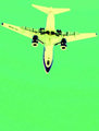
Artistic Merit
Pros:
* Good subject placement, gives us a clear view of it's evolution.
* Interesting and unusual perspective.

Cons:
* The crop is just too tight. The subject has very little space to "breathe".
* It's too aligned with the frame and thus too "stable". Such a photo would benefit a lot from more more dynamic lines and I think a an angular approach works better.

Technical Merit
Cons:
* Sharpness and focus are compromised. With the kind of equipment you were using you should have gotten away easily with a much faster shutter speed without compromising IQ, either by opening up the lens or raising ISO or both. The subject speed required it and you had still had plenty of play.

Emotional Merit
Pros:
* This crossprocessing turned a boring plane picture into something interesting. Quite Warhol-ish as bcenu has put it.
Cons:
* Unfortunately your choice of colors wasn't the best IMHO. There are only cold colors in this picture and these don't convey the kind of energy expected from such a subject. Complementary colors would have given this picture more punch.

Result
It's interesting to see that similar pictures could get get you from first place:
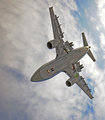
 to middle ground or bottom of the pack in your case. I voted your picture 5* and 7* on the others, but looking at their placement it's more or less obvious what you got wrong and what they got right.
My take from the comments is that the coloring was missfortunate with the focus/sharpness hitting hard in second.

Keep them coming and don't let those less achieved photos let you down. You are bound to get better.

All the best
Duarte Bruno
Photographer found comment helpful.
Welcome to Las Vegas!!!!!
02/16/2010 11:41:50 PM
Welcome to Las Vegas!!!!!
by marcoesquivel

Comment by bcenu:
Looks a bit Andy Warhol-ish. Good effect and perspective.
Welcome to Las Vegas!!!!!
02/16/2010 12:56:22 PM
Welcome to Las Vegas!!!!!
by marcoesquivel

Comment by ThingFish:
No perspective here and really horrible colors. Don't get the title either. 4
Seul dance le mer
02/15/2010 05:00:24 PM
Seul dance le mer
by marcoesquivel

Comment by Citadel:
Greetings from the Critique Club!

The first thing I will say is to make sure you use the full size allowed. You are really putting your image at a disadvantage when you submit a smaller image.

So that aside, the image is simple and its simplicity can be greatly appreciated (you got an average of 7 from commenters) or not appreciated at all.

As the one commenter indicated it would be nice to see more of the bench. Then again, you appear to have deliberately matched the lines of the back of the bench with the railing so that may have been more difficult had you included more of the bench.

The colors are nice without being oversaturated. Exposure is pretty good except the railing is a bit out of focus due to the large aperture you used. My guess is since you were using such a long lens you were relatively far away. If you were on a tripod you could have gone with around f/11 and got the railing and the bench in focus. (I am guessing though).

Overall, an original take on the challenge and in my opinion well seen.
Pages:  
Showing 1 - 10 of ~41


Home - Challenges - Community - League - Photos - Cameras - Lenses - Learn - Help - Terms of Use - Privacy - Top ^
DPChallenge, and website content and design, Copyright © 2001-2025 Challenging Technologies, LLC.
All digital photo copyrights belong to the photographers and may not be used without permission.
Current Server Time: 06/25/2025 03:17:53 AM EDT.