| Image |
Comment |
| 10/30/2010 08:50:16 AM |
|
 Photographer found comment helpful. Photographer found comment helpful. |
| 10/08/2010 08:40:28 AM |
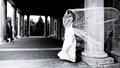
Regarding Manh-Danby abuscemiComment by Jutilda: Very artistic and much too avant garde for the average voter. I love the diagonal line connecting the groom to the bride. Nice one. |
| Photographer found comment helpful. |
| 10/07/2010 11:40:25 PM |
|
| Photographer found comment helpful. |
| 10/07/2010 09:37:34 PM |
|
| Photographer found comment helpful. |
| 10/07/2010 09:33:40 AM |
Regarding Manh-Danby abuscemiComment by giantmike: Good choice of B&W. I really like the idea of the veil blowing around. I'm not super keen on the position on the groom (so far back). |
| Photographer found comment helpful. |
| 10/03/2010 12:49:30 PM |
|
| Photographer found comment helpful. |
| 10/02/2010 03:30:17 PM |
Regarding Manh-Danby abuscemiComment by tanguera: These guys are going to LOVE their wedding shots. Bravo for creating art from what can be a tedious series of "standard" wedding images. I think the lighting on the farthest columns really makes this image by adding superb depth and complexity. And helps us find the groom, who would otherwise be practically invisible. As it should be :-) |
| Photographer found comment helpful. |
| 09/07/2010 08:48:38 PM |
|
| Photographer found comment helpful. |
| 09/05/2010 10:17:57 AM |
Aloneby abuscemiComment by Paul: I'm going through the entries, stopping at those images I feel have had the benefit of an unconventional eye and dwelling a little longer to try to see and appreciate what you saw. This is one of those images.
Positives: I like unusual portraits and this falls squarely into that camp. The hemi-face coupled with the deep perspective offered by the industrial background works really well. I think your choice of aperture offers a DOF that works really well. The aspect ratio / crop is just perfect for this
Critical stuff: There are some minor things that bother me. The blue fringing in the background, the blown highlights top right, the slightly jaundiced appearance of the skin tone - but all of these are only slightly sub-optimal.
Overall. Very nice work |
| Photographer found comment helpful. |
| 09/02/2010 02:46:32 PM |
Aloneby abuscemiComment by tanguera: Very interesting image. I love the depth of the warehouse, despite the blur. Very nicely done. The crop on the face is also interesting and adds an enigmatic element. But the harsh white lighting doesn't quite fit the mood of the rest of the image. I also wish he were looking somewhere else - off camera to the right or left, or even straight at the camera. |
| Photographer found comment helpful. |
Home -
Challenges -
Community -
League -
Photos -
Cameras -
Lenses -
Learn -
Help -
Terms of Use -
Privacy -
Top ^
DPChallenge, and website content and design, Copyright © 2001-2026 Challenging Technologies, LLC.
All digital photo copyrights belong to the photographers and may not be used without permission.
Current Server Time: 07/17/2026 02:39:30 AM EDT.