DPChallenge: A Digital Photography Contest You are not logged in. (log in or register
 
Browse Settings
Currently viewing:
Registered Userdali_lama_2k

Show comments:

Per page:

Order:

Comments:


Comments Received by dali_lama_2k
Pages:   ...
Showing 241 - 247 of ~247
Image Comment
Into the Ether
03/24/2010 08:22:00 AM
Into the Ether
by dali_lama_2k

Comment by Jutilda:
The title gives it an extra point from me!!
Photographer found comment helpful.
No Parking
03/24/2010 12:05:22 AM
No Parking
by dali_lama_2k

Comment by dali_lama_2k:
I know! Too late, I realized the image I had initially selected would have been disqualified for being prior to the challenge announcement, and this was a hastily-chosen-slapped-in-there pic. Poo on me, for shame! for shame!

Message edited by author 2010-03-24 00:05:48.
No Parking
03/19/2010 06:05:33 PM
No Parking
by dali_lama_2k

Comment by Nadine_Vb:
Why haven't you straightened this photograph??
Now it looks like a quick job without any effort, just to enter something in the challenge.
Photographer found comment helpful.
No Parking
03/18/2010 09:28:13 AM
No Parking
by dali_lama_2k

Comment by Neat:
THis does nothing for me. sorry :(
The Truth according to Man
02/27/2010 07:56:58 PM
The Truth according to Man
02/27/2010 03:11:13 PM
The Truth according to Man
by dali_lama_2k

Comment by Gatorguy:
Hi, Critique Club here...

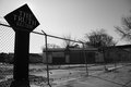
I get what you're going for here, but I think this might be a case where you can't get the feeling of being there to translate through a photograph. Your central points are the sign and the overall appearance of this lot and to that end, the placement of the sign is good, it's the first place I looked when I opened the image. Then my eye followed the strong leading line, which is the fence, but unfortunately the line leads us to a place in the photo that doesn't contain anything of interest - the middle right side. It's such a strong element in this photo that it's hard to get past it without being distracted by it. You have to make an effort to see beyond it to delve further into the image - not a good thing for a viewer. Also, I think the sign is too dark, I would have liked to have seen some detail in it.

The building that appears to be run down is in shadow which makes it hard to actually get the feel for it. Looking through the fence give the image a feeling of isolation, but at the cost of distracting the viewer from whats inside.
So I think to improve, you want to shoot at a time of day that best shows your subject. You'll also want to be conscious of what the various elements are contributing to what you're trying to say. Remember the old photography adage... What doesn't contribute to the photo, detracts from it.

To do well here, you'll have to either have eye candy, a hugely emotive subject, and/or a technically perfect image.

I hope you take this mostly negative critique in the spirit in which it was given - and rememeber, this is only one opinion and not gospel.

Good luck to you in future challenges.

Message edited by author 2010-02-27 15:18:32.
Photographer found comment helpful.
The Truth according to Man
02/19/2010 03:05:08 PM
The Truth according to Man
by dali_lama_2k

Comment by Luci11e:
I like the way you've used the sun behind the sign
Photographer found comment helpful.
Pages:   ...
Showing 241 - 247 of ~247


Home - Challenges - Community - League - Photos - Cameras - Lenses - Learn - Help - Terms of Use - Privacy - Top ^
DPChallenge, and website content and design, Copyright © 2001-2025 Challenging Technologies, LLC.
All digital photo copyrights belong to the photographers and may not be used without permission.
Current Server Time: 06/15/2025 05:57:36 AM EDT.