| Image |
Comment |
| 01/28/2010 01:03:47 PM |
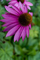
Half Empty or Half Fullby kdkavanaghComment by Nuzzer: Hi from the Critique Club
First impressions are that the shot is nice and vivid but unbalanced. From your comments it's clear you were going for the dying flower look but in the shot it just looks like some petals have been pulled off. This gives the flower an unbalanced look. This detracts from the delicate nature of the flower.
Technically the shot is good, DOF is chosen well and the second flower is a good addition to the shot. Placing the flower off centre is good but the negative space here does not help. A crop that removed the green area at the bottom but leaves the main flower slightly off centre due to the other flower may have held more interest.
Good luck
Gerry |
| 01/20/2010 09:13:03 AM |
|
| 01/20/2010 01:33:36 AM |
|
| 01/13/2010 10:40:14 PM |
|
| 11/30/2009 02:41:23 PM |
The Church's Powerby kdkavanaghComment by Citadel: Greetings from the Critique Club!
The building looks interesting with a lot of good images to be shot. As previous commenters indicated the image needs to be levelled.
I'd almost want to crop down to a stone work in the arch or other details. Otherwise you need to step back and get more of the church. As it was shot it looks a little too tight.
I also see that you shot at f/4 on a tripod. There's nothing wrong with that but you'll get better sharpness if you shoot around f/8 to f/11. Use a larger aperture if you want a shallower depth of field. (e.g if you got even close and focused on the detail in the arch the focus would fall off nicely).
In terms of the challenge? Yup its centrally composed. I think that was the easy part of the challenge. The hard part was a) finding a subject that was suitable for that sort of composition b) framing the subject where the composition was effective.
Overall? not a bad shot at all. A heck of a lot better than my first challenge entry on this site and better than most first timers. Welcome to DP challenge and I hope to see more of your images!
|
 Photographer found comment helpful. Photographer found comment helpful. |
| 11/24/2009 09:31:39 AM |
|
| Photographer found comment helpful. |
| 11/22/2009 08:37:04 PM |
|
| 11/22/2009 10:04:32 AM |
|
| 11/22/2009 09:32:44 AM |
|
| 11/20/2009 02:39:43 PM |
|
Home -
Challenges -
Community -
League -
Photos -
Cameras -
Lenses -
Learn -
Help -
Terms of Use -
Privacy -
Top ^
DPChallenge, and website content and design, Copyright © 2001-2026 Challenging Technologies, LLC.
All digital photo copyrights belong to the photographers and may not be used without permission.
Current Server Time: 07/03/2026 01:13:17 PM EDT.