| Image |
Comment |
| 04/30/2005 02:04:06 PM |
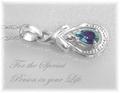
For that special someoneby trainComment by Catherine_B: pendant is blown out and you cant distinguish between the background and the silver of the pendant. Nice layout and lettering, but this doesn't make me want to buy the item. |
| 04/30/2005 03:04:20 AM |
|
| 04/29/2005 09:40:30 PM |
|
| 04/29/2005 06:40:36 PM |
|
| 04/29/2005 03:07:36 PM |
For that special someoneby trainComment by woohoopepper: Great idea and layout. Maybe a little oversharpened, and the text maybe could be a slightly darker gray just to stand out but not to overshadow the jewelry. 8 |
| 04/29/2005 02:31:15 PM |
|
| 04/29/2005 02:00:49 PM |
|
| 04/29/2005 08:44:07 AM |
For that special someoneby trainComment by shareinnc: Interesting idea for composition, but it makes me want to tilt my head. The soft focus (or filter...I'm honestly not sure which it is) doesn't quite work. |
| 04/29/2005 06:48:39 AM |
|
| 04/29/2005 02:28:50 AM |
|
Home -
Challenges -
Community -
League -
Photos -
Cameras -
Lenses -
Learn -
Help -
Terms of Use -
Privacy -
Top ^
DPChallenge, and website content and design, Copyright © 2001-2026 Challenging Technologies, LLC.
All digital photo copyrights belong to the photographers and may not be used without permission.
Current Server Time: 06/10/2026 02:47:37 PM EDT.