Harry Potter and the Sorcerer´s Stoneby
cimarron98Comment by Neil: Greetings from the Critique Club!
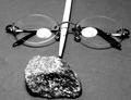
I think you had a great idea here, and selected a good set of elements to give us the feel for the book. I also like the choice of B&W here.
On the technical side, there are a couple of things that can be improved here. I don't think the light reflection in the glasses is needed if done intentionally, and at best distracts a bit, especially because I can see some detail in it, i.e., the bulb.
The wand itself is the major problem I see here. It's overexposed, and I don't think it's placed optimally in the image. It's almost as if it's arranged to be the nose, the glasses the eyes, and the rock the mouth, making a face, which distracts a bit. I am not sure how I would arrange them without some playing, but I would think I might have tried the wand coming in from one corner, and the other objects symmetrical on the other diagnoal. But I would have to experiment to see what worked best. Some other suggestions:
1) A dark, nonreflective base and background would have given this some extra pop
2) A sheet over the light source and putting it back would have diffused the light and eliminated the reflection. A circular polarizer might have also been effective here.
Glad to see such a creative entry and I look forward to seeing more of your work.