| Image |
Comment |
| 12/04/2003 09:11:45 PM |
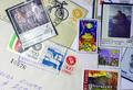
Its like money, but more funny to collectingby cimarron98Comment by ahaze: Technical: Fits the challenge. Exposure/lighting looks like flash, which is unattractive. Composition is too busy. Focus is good.
Personal: Somewhat creative but more time spent on the project would have produced a better shot.
My vote: 3 |
 Photographer found comment helpful. Photographer found comment helpful. |
| 12/04/2003 06:18:11 PM |
|
| Photographer found comment helpful. |
| 12/03/2003 05:35:47 AM |
|
| Photographer found comment helpful. |
| 12/02/2003 01:25:22 PM |
Happy for everby cimarron98Comment by MWitt: Subject matter is a little too far away for this soft focus. If you could have gotten a little closer, maybe the effect wouldn't have been as strong. Good composition. |
| Photographer found comment helpful. |
| 12/02/2003 10:39:44 AM |
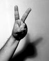
Victory... or only shades Mr. Bushby cimarron98Comment by BobsterLobster: Critique Club:
I'm not sure I really understand the intention behind this photo. Is this the V for victory sign as used by Churchill? Where is the irony that the title hints at? Is this a pun on the title, where the shade is the shadow thrown by the hand? For propaganda, the image is not in any way hard-hitting enough as the message is unclear and ambiguous.
I'm not a fan of the burnt out highlights on the left side of the frame, and the noise levels in the shadow detract from the picture IMO.
The black and white works well here, and I like the tonal contrasts that can be found in the hand and arm.
In conclusion, I don't think the photo's message is communicated clearly enough for this to be an effective example of propaganda. I think you also need to watch out for overexposed highlights... I loved your shot of the child with dog which also sadly had burnt out highlights. |
| Photographer found comment helpful. |
| 12/02/2003 03:55:22 AM |
|
| Photographer found comment helpful. |
| 12/01/2003 10:41:56 PM |
Happy for everby cimarron98Comment by fotofrog: Nice composition! I may not have this right, but to me, it looks more out of focus than soft focus, but that is just my opinion. Otherwise, great photograph! |
| Photographer found comment helpful. |
| 12/01/2003 10:16:35 AM |
Happy for everby cimarron98Comment by moodville: This comes across more as out of focus than soft focus, sorry. The composition is good, and the setting is good for a soft focus image but it's just a little too blurry. |
| Photographer found comment helpful. |
| 12/01/2003 08:02:51 AM |
Thanks God for Himby cimarron98Comment by jonpink: bad points the grey area at the top left. the ditracting background buildings.
Good points great superb perfect contrast. i hate those wishy-washy white images that 99% of people do. This is just my taste. Nice and sharp also.
Overall Score 5
|
| Photographer found comment helpful. |
| 12/01/2003 12:04:15 AM |
|
| Photographer found comment helpful. |
Home -
Challenges -
Community -
League -
Photos -
Cameras -
Lenses -
Learn -
Help -
Terms of Use -
Privacy -
Top ^
DPChallenge, and website content and design, Copyright © 2001-2026 Challenging Technologies, LLC.
All digital photo copyrights belong to the photographers and may not be used without permission.
Current Server Time: 07/16/2026 10:57:36 AM EDT.