| Image |
Comment |
| 10/06/2009 09:15:49 AM |
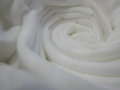
Wrinkledby mfreealohaComment by glad2badad: You've captured the feeling of softness here for sure. The curls work for the challenge. Not sure about the off-white greyish look to this. May have been your intention but it seems like this needs a good tweak with levels. |
| 10/04/2009 07:57:55 AM |
Wrinkledby mfreealohaComment by rennie: The fact that it's out of focus makes it look like a white rose. Interesting effect - I wonder whether it was intentional. The white however looks grayish a bit and at least the center could be in focus. |
| 10/02/2009 10:33:22 PM |
|
| 10/01/2009 04:08:02 PM |
|
| 10/01/2009 02:30:41 PM |
Wrinkledby mfreealohaComment by Jaded_Housewife: *not voting as I'm in this challenge-just commenting since I've seen requests for comments in the challenge thread*
Nice. Looks soft and fuzzy. not sharp enough for my tastes though. |
| 09/30/2009 01:01:42 PM |
Wrinkledby mfreealohaComment by Yo_Spiff: Maybe a little to much on the soft focus for my own preference. Nice crisp details on the fabric might have made more impact on me, but as I said, that is a preference thing, not a flaw of any kind. |
| 09/29/2009 10:13:36 PM |
|
| 09/29/2009 02:22:38 PM |
|
| 09/26/2009 11:37:26 AM |
|
| 09/25/2009 11:15:45 PM |
xoby mfreealohaComment by Yo_Spiff: I think this has some potential that could be brought out. White balance could use some adjustments is the first thing that strikes me. I think some other common tweaks such as curves, saturation contrast and sharpening would also help. In fact, I copied this into PaintShop Pro to see, and those adjustments did bring it up a notch. |
Home -
Challenges -
Community -
League -
Photos -
Cameras -
Lenses -
Learn -
Help -
Terms of Use -
Privacy -
Top ^
DPChallenge, and website content and design, Copyright © 2001-2026 Challenging Technologies, LLC.
All digital photo copyrights belong to the photographers and may not be used without permission.
Current Server Time: 07/03/2026 08:58:16 AM EDT.