High Ho Silverby
pats66Comment by macrothing:  Critique Club Critique
First Impressions
Critique Club Critique
First Impressions
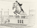
Oh, I did like this during voting, but the main subject - 'High Ho Silver' was placed too high in the frame for me (no pun intended). I gave this a 6.
Photograph Information, Technicals & Composition Review
A deeper depth of field to get more of the horse's features in focus would have been better in my opinion.
Toning: I am a little undecided on the high key b&w effect for this image, I don't think it is enhancing the subject - but with a little more depth/contrast, perhaps. Composition: as mentioned, I think the horse is placed to high within the frame - I wonder about a tighter crop on the left and at the bottom, if the quality was there.
I know this image is being mostly about the horse, but there is still a rider there and they are not making eye contact with the camera, nor looking in the direction of the camera, minor, but I still think it has an impact on the 'connectionability'.
Some interesting elements in the image, especially the 'braces' (no idea what they are called) on the horse's hooves/ankles - alas the detail is near lost.
Comments, Score & Placement Review
264/419 is a fairly good showing in a Free Study, and a score of 5.45 also so. Horses are always a favorite (including with me).
All of your commenters were taken with the image and this is affirmed by their average score given of 7.33.
Summary
Good capture, and an artistic processing, which as mentioned, is a little too 'depthless' for me, but obviously appeals to many others - and if you prefer it this way, then that is the main thing. A variation in cropping I think would definitely have given the image a little more edge.