| Image |
Comment |
| 02/28/2010 08:47:37 PM |
|
 Photographer found comment helpful. Photographer found comment helpful. |
| 02/28/2010 03:05:45 PM |
|
| Photographer found comment helpful. |
| 02/24/2010 08:52:51 PM |
|
| Photographer found comment helpful. |
| 02/24/2010 12:52:47 PM |
|
| Photographer found comment helpful. |
| 02/22/2010 07:17:47 AM |
|
| Photographer found comment helpful. |
| 02/22/2010 02:36:41 AM |
|
| Photographer found comment helpful. |
| 02/01/2010 01:59:15 PM |
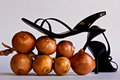
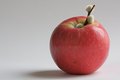
CottonAppleby MArteSiComment by Nuzzer: Greetings from the Critique Club.
First impressions are that this has a nice minimalist feel to it and that is good.
Technically the composition is good and the lighting is fine, if not just a little bit flat.
Artistically there are two things I think let this shot down. First, what are those things on the apple stalk? They don't add value and take away from the uncomplicated feel this shot has. Also, the grey background seems to be too bland, a different colour (not too colourful) or a slight pattern perhaps?
In summary this shot is ok and has great potential but just doesn't pull it off.
PS: Get out there and cast some votes ;)
Feel free to PM
me if you have any queries.
Gerry |
| Photographer found comment helpful. |
| 01/30/2010 10:18:48 PM |
CottonAppleby MArteSiComment by glad2badad: Cute concept. Not sure that the grey bg works as well as black or true white could have. Considering that this is running under advanced editing the lines on the area near the apple could have been cleaned up, as well as the dark spot on the front. Nits? Yep. :-) Good luck. |
| Photographer found comment helpful. |
| 12/23/2009 12:36:39 AM |
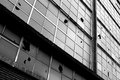
Crosswords On The University Wallby MArteSiComment by ericwoo: Hey there from the Critique Club
My thoughts on the image: This was one of my favorite voting challenges as of recent history here. I like the vast array of options and situations that the challenge lent itself to shooting. Here, you have a great start, but the image is lacking in my opinion. I think that's I'd like to see the crop a little wider, as my eye wants to think so much more exists to the decay portion of the image. Your lighting is a bit harsh, graduating from the dark, near-under exposed left hand side to the bright, near over exposed right hand side.
My ideas for improvement: Open the crop up and show me more decay. I do get the feeling of the withering structure, but I don't see enough destruction to make me really love this image.
Where I would have/did score this entry: I did vote in this challenge, and I was one of your 4s. This one could have easily grown in my mind with a different crop and composition.
Thank you for the opportunity to provide a critique on your entry,
Eric
|
| Photographer found comment helpful. |
| 12/16/2009 08:08:04 AM |
|
| Photographer found comment helpful. |
Home -
Challenges -
Community -
League -
Photos -
Cameras -
Lenses -
Learn -
Help -
Terms of Use -
Privacy -
Top ^
DPChallenge, and website content and design, Copyright © 2001-2026 Challenging Technologies, LLC.
All digital photo copyrights belong to the photographers and may not be used without permission.
Current Server Time: 05/05/2026 04:59:59 AM EDT.