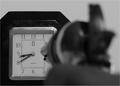
DPChallenge: A Digital Photography Contest You are not logged in. (log in or register
 
Browse Settings
Currently viewing:
Registered UserCam

Show comments:

Per page:

Order:

Comments:


Comments Received by Cam
Pages:   ... [251] [252] [253] [254] [255] [256] [257] ... [264]
Showing 2531 - 2540 of ~2634
Image Comment
Simple Pleasures
12/10/2003 11:49:53 AM
Simple Pleasures
by Cam

Comment by EL-ROI:
I have to laugh here...This is so funny.
Photographer found comment helpful.
Simple Pleasures
12/10/2003 08:57:16 AM
Simple Pleasures
by Cam

Comment by amsmyth:
pleasures of dishwasher? nice image, a little hot on the Cascade, textures good,
good humored
Photographer found comment helpful.
On The Pier
12/06/2003 02:29:24 PM
On The Pier
by Cam

Comment by coolhar:
looks tilted
Photographer found comment helpful.
On The Pier
12/02/2003 07:56:58 AM
On The Pier
by Cam

Comment by jmsetzler:
tonal range is a bit flat... horizon tilted...
Photographer found comment helpful.
On The Pier
12/01/2003 12:11:32 AM
On The Pier
by Cam

Comment by justine:
I can really feel the vastness of the ocean looking at this shot. Good perspective and the near ground with the birds is an excellent touch. I think some adjustment of saturation would of increase the 'wow' of this shot to really enhance the sky. All in all I think this is good and should do well. 7
Photographer found comment helpful.
Just Killing Time
11/29/2003 01:52:54 AM
Just Killing Time
by Cam

Comment by LucidLotus:
Hello from the Critique Club!

Excellent photo! There are some great contrasts visible here and it clearly meets the challenge.

What first catches my eye is the wonderful contrast between the crisply rendered clock and the blurred out gun. I have to disagree with many of the previous comments, I think the photo has an increased impact with this obvious contrast, and a good deal of the punch would be lost if the whole image were in complete focus. I think the emphasis/focus of the image should be on the clock, as it is the recipient of the action as described by the title.

The second great contrast is that of the black & white. The image is really accentuated with the black & white choice - I don't know if the clock surrounds are actually black, but it makes for a very clean image with this color scheme all the same. The crispness generally inherent to black/white really lends itself to boosting the contrast in the focus.

Secondly I think the low light, or at least low tone of the photo is great. A brighter look, while stark, would probably overpower an already striking image. The low light instead forces the focus on the two main entities in the photo and doesn't compete with the energy they display. Even if it isn't able to highlight the contrast in the black & white as mentioned previously.

The composition is excellent - I really like how the image seems to grow out from the bottom left corner. I do have a suggestion, and that would be to see how it would look if the perspective was straight down the barrel instead of the side view. I'm not sure if this would block out too much of the clock and render the gun unrecognizable.. thereby nullifying much of the dynamic of the photo or not. Its a thought though.

I think this was a well thought out idea, set up and executed nicely. I also think, though I found it a plus, the low lighting may have affected some of the scores, as did the choice for the gun to be out of focus. I find both of those to enhance the essence of the image.

All in all, an excellent submission. There really isn't anything I would suggest changing besides the alternative perspective. Nicely done.
Photographer found comment helpful.
Valve Handbook (Philip L. Skousen)
11/25/2003 09:45:50 AM
Valve Handbook (Philip L. Skousen)
by Cam

Comment by vtruan:
Critique Club review:

Hi Cam,

I have no idea if you have chosen a real book or not, but the photo fits your title well and I believe that a book has been written on this subject, so what the heck.

Not being a car buff, I know a clean chrome engine is what you want. You have definitely provided a great photo of a classic Corvette engine. I have though of some ideas of what it might look at different cropping or a bit more of the engine, but your cut is fine and doesn't effect the shot.

The chrome is really nice, especially not seeing any distraction in the reflection of the chrome, which can ruin a shot. I like the bluish-sky reflection, it helps.

Your contrasts and shading are very good and dof is right on. I like the red wire modifier, the color adds a nice touch and probably is needed. Also, the wires take your eyes off the photo, but bring it back nicely on top. This keeps the eye toward the center, this to me is great.

The only downfall, which is minimal, is the interest. I is not the most interesting subject, especially to an engine dummy like me, but you made the shot fit and made it look very well.

Hope this helps a bit.

Van
Photographer found comment helpful.
Just Killing Time
11/23/2003 08:34:12 PM
Just Killing Time
by Cam

Comment by Neil:
Good shot ;) I'd like to have seen more DOF.
Photographer found comment helpful.
Just Killing Time
11/23/2003 12:31:01 AM
Just Killing Time
by Cam

Comment by Miah:
tick tock tick tock clickBOOM - AHHH i can't feel my second hand!
Photographer found comment helpful.
Just Killing Time
11/21/2003 06:32:09 PM
Just Killing Time
by Cam

Comment by wetland:
would really like to have seen the pistol in better focus...but neat idea.
Photographer found comment helpful.
Pages:   ... [251] [252] [253] [254] [255] [256] [257] ... [264]
Showing 2531 - 2540 of ~2634


Home - Challenges - Community - League - Photos - Cameras - Lenses - Learn - Help - Terms of Use - Privacy - Top ^
DPChallenge, and website content and design, Copyright © 2001-2025 Challenging Technologies, LLC.
All digital photo copyrights belong to the photographers and may not be used without permission.
Current Server Time: 06/16/2025 05:50:10 AM EDT.