| Image |
Comment |
| 03/18/2010 10:03:42 AM |
|
| 03/17/2010 01:50:41 PM |
|
| 03/17/2010 12:29:25 AM |
|
| 02/16/2010 03:43:31 PM |
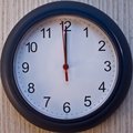
Counting Downby deanralstonComment by paynekj: For me it's lacking a bit of contrast. I feel you could have increased the contrast and made the white clock face much brighter and the black numbers much darker. Good subject though |
| 02/10/2010 04:51:00 PM |
Counting Downby deanralstonComment by MaryO: Not an exceptionally interesting clock to me, visually, so I might try different angles or something. Also looks like it could use a wee contrast boost on my screen. |
| 02/10/2010 06:02:51 AM |
|
| 12/30/2009 11:25:58 AM |
|
| 12/30/2009 12:50:39 AM |
|
| 12/30/2009 12:27:40 AM |
|
| 12/29/2009 12:12:02 AM |
|
Home -
Challenges -
Community -
League -
Photos -
Cameras -
Lenses -
Learn -
Help -
Terms of Use -
Privacy -
Top ^
DPChallenge, and website content and design, Copyright © 2001-2026 Challenging Technologies, LLC.
All digital photo copyrights belong to the photographers and may not be used without permission.
Current Server Time: 07/15/2026 07:44:01 PM EDT.