Stone's Archby
alinaComment by Mark-A: Greetings from the Critique Club :)
Composition:
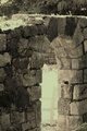
The composition elements in the shot are actually quite nice the rule of thirds appears to be followed with the right hand wall line of the arch, I think a stronger composition could be achieved with a crop to the top so that the upper edge of the wall is not seen, this takes away the distractions in the upper part of the image and focuses the eye down on to the bench more.
Camera Work:
Exposure and focus seems pretty good and there appears to be good tonal range within the image.
Post-Processing:
I REALLY like the low Hue / Sat feel of the image and with the crop I mentioned above I think the image is almost fairytale like, I also think a little sharpening and a Shadow / Highlight tweak would enable you to pull out a touch more detail in the stone work.
My Opinion:
An interesting take on the challenge and the spotting of the wonderful lighting on the bench was a good catch.
Overall a nicely different take on the challenge, congratulations on putting your first entry out there to the voters don't let the low score put you off entering more, it's just a matter of working out what the voters want, by voting and commenting on challenges I am sure you will pick this up very quickly.
Good luck in future challenges!
Mark