DPChallenge: A Digital Photography Contest You are not logged in. (log in or register
 
Browse Settings
Currently viewing:
Registered Userchanneled

Show comments:

Per page:

Order:

Comments:


Comments Received by channeled
Pages:   ... ... [63]
Showing 331 - 340 of ~624
Image Comment
Light As A Feather
11/18/2003 08:08:48 AM
Light As A Feather
by channeled

Comment by tfaust:
I like the colors in this shot... but it seems a little 'overdone' or maybe overexposed on the lightest green... the details of the feathers are lost here.
Light As A Feather
11/17/2003 09:21:53 PM
Light As A Feather
by channeled

Comment by adine:
I love the electric blue against the dark, but the cyan is too bright and all deatil is lost. Just that small bit of fragile blue really suggests "light as a feather."
Light As A Feather
11/17/2003 09:21:01 PM
Light As A Feather
by channeled

Comment by Shannon:
seems a bit overexposed.
Light As A Feather
11/17/2003 10:10:13 AM
Light As A Feather
by channeled

Comment by deckyon:
Interesting effect. Has an ice crystal or fractal feel.
Light As A Feather
11/17/2003 09:46:31 AM
Light As A Feather
by channeled

Comment by sonnyh:
While I think you have picked a great literalism your portrayal of it is a little lacking. This to me does not show in any way how light the feather is and the feather seems to have a lot of noise in it. A little photo editing program might have helped.
Light As A Feather
11/17/2003 09:26:04 AM
Light As A Feather
by channeled

Comment by ScantyNebula:
Whoa....what is this supposed to be? The effect you were going for isn't working for me, its hard to tell what this picture is supposed to represent. The title you are working with suggests that maybe if you had a feather on a weighing meter it would make sense
Light As A Feather
11/17/2003 12:48:25 AM
Light As A Feather
by channeled

Comment by moodville:
The color mix and brightness suggests this was played around with in editing software. Whereas the idea of having feathers in the image coupled with the common phrase is good, I personally dislike color-manipulated images of this fashion. I'm sure some people like it and can give you some honest and good feedback, but this just isnt my cup of tea.
The Plots Thicken
11/16/2003 09:36:51 PM
The Plots Thicken
by channeled

Comment by amazoneea:
Greetings from The Critique Club

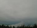
The death seems infinite indeed. It is a good choice for the challenge.
The nice, saturated colors prevent the photo from looking sad as you
choose to see the infinite side of it with relaxation. It would have been nice if you had cropped a bit from the top of the picture and make those colors disappear as they limit the infinity of the scene on a close look.

My eyes are looking for a strong point of interest but they can't find much. Trying to be faithfully to the subject of the challenge you have sinned by not choosing one particular subject to stand out more than the rest. Without it, the composition it's just saying: "Repetition... Continuity..." It is a bit boring. The colorful flowers are too far
to represent the attraction of the picture. I wish you could find a closer bouquet and took the shot from a different angle, avoiding the distracting string for the sake of the image.
The rest is good and it was a pleasure to comment on your photo. Not that it was an easy one to comment.
Congratulation on the good finish and keep up the good work!

Regards,
Elena


Atop Sacred Ground
11/13/2003 11:20:41 PM
Atop Sacred Ground
by channeled

Comment by Neuferland:
This so reminds me of home, back on Montana when you are sitting on top of the mountain and just gazing in amazement at the wonder of it all. But the over abundance of sky on this shot is not helpful to me pesonally, I would have liked to seen more land, a more evened balance, if you will. The shot could also be brightened just a tad to really help it pop out. A 4
By The Light Of The Moon
11/13/2003 09:08:51 PM
By The Light Of The Moon
by channeled

Comment by adine:
The moonlight on the clouds has a great soft quality to it. I'd crop a bit more on the bottom, make that diagonal line of clouds fill the frame a bit more. It would be nice if there were more definition to the moon - a sharp edge and maybe some craters. But if your expose was for the face of the moon, you might not get the light on the clouds as nicely
Pages:   ... ... [63]
Showing 331 - 340 of ~624


Home - Challenges - Community - League - Photos - Cameras - Lenses - Learn - Help - Terms of Use - Privacy - Top ^
DPChallenge, and website content and design, Copyright © 2001-2026 Challenging Technologies, LLC.
All digital photo copyrights belong to the photographers and may not be used without permission.
Current Server Time: 04/02/2026 10:53:27 PM EDT.