| Image |
Comment |
| 05/29/2009 10:59:18 PM |
|
| 05/27/2009 06:09:23 PM |
My time is upby cooliComment by SEG: Very out of focus and the shadow that it casts on the ceiling is very distracting. |
| 05/27/2009 02:45:55 PM |
My time is upby cooliComment by Ammie: Did you use a tripod? With a little editing this picture would have been brilliant. The idea is just out of this world and very original. Congrats. |
| 05/27/2009 10:38:35 AM |
|
| 05/19/2009 09:01:50 PM |
|
| 05/14/2009 05:09:55 PM |
|
 Photographer found comment helpful. Photographer found comment helpful. |
| 05/14/2009 01:31:54 PM |
|
| Photographer found comment helpful. |
| 05/14/2009 12:33:41 PM |
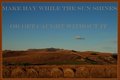
A hard day's Workby cooliComment by MistyMucky: Not a lot of contrast, a fact which is made even worse by the grey writing. Depending on what's in front of the first line of bales, there could be a great potential for a layered landscape (blue-brown-whatever). On the other hand there's a great mood in your picture. |
| Photographer found comment helpful. |
| 05/13/2009 12:52:07 PM |
|
| Photographer found comment helpful. |
| 05/13/2009 02:38:06 AM |
A hard day's Workby cooliComment by kaiser_chief: Would have preferred to see this presented in the traditional Poster format. The second line of writing starts to fade into the scene which I am not a fan of, and I also do not like the border you have applied. The image connects well with the message you have chosen though, but the colouors mean that the hay does not stand out as much as it should. |
| Photographer found comment helpful. |
Home -
Challenges -
Community -
League -
Photos -
Cameras -
Lenses -
Learn -
Help -
Terms of Use -
Privacy -
Top ^
DPChallenge, and website content and design, Copyright © 2001-2026 Challenging Technologies, LLC.
All digital photo copyrights belong to the photographers and may not be used without permission.
Current Server Time: 07/16/2026 12:21:34 PM EDT.