| Image |
Comment |
| 09/05/2009 01:17:41 PM |
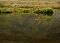
The fading summerby EgillPComment by dafletchr: I like this shot. Beautifully composed and it has the feeling of a
painting. The reflection and textures in the water are great. |
 Photographer found comment helpful. Photographer found comment helpful. |
| 09/04/2009 04:00:16 PM |
|
| Photographer found comment helpful. |
| 09/04/2009 08:30:14 AM |
|
| Photographer found comment helpful. |
| 09/01/2009 09:44:38 PM |
|
| Photographer found comment helpful. |
| 08/30/2009 02:23:37 PM |
|
| Photographer found comment helpful. |
| 08/27/2009 01:25:40 AM |
Cool !by EgillPComment by kkerri1: is the camera tilted? it feels about 10deg too counterclockwise. |
| Photographer found comment helpful. |
| 08/26/2009 10:22:48 AM |
|
| Photographer found comment helpful. |
| 08/18/2009 02:33:29 AM |
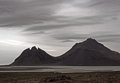
Shades of grey.by EgillPComment by JulietNN: Hi from the C Club
Fabulous title you have there fits teh shot very well.
I think a little more of a crop at the bottom would have made the water pop out a bit more, you have some fabulous cuvey lines going on there and would have been nice to see then some more. You do have some grain going on here and some tight halos around the mountain tops.
In post processing, a tip that I worked out is that before you turn it into black and white, is to play around with the saturations, selective colours , curves and brightness contrast. then turn it into black and white, you will be amazed at what a difference it makes to your details.
I bet this is an amazing place to see
|
| Photographer found comment helpful. |
| 08/08/2009 04:14:44 AM |
Shades of grey.by EgillPComment by EgillP: Thanks for all the nice comments on my first free study. The light that day was very grey with dust blowing from the nearby glacierbed causing this mist. I found it suited the picture better to reduce the colour still than to pop it up.So after levels and cropping, I faded saturation 50% in h/s, added some tone in coloe balance and tried to find texture in both sky and mountainside with curves and in s/h. |
| 08/03/2009 11:56:39 AM |
DistantColoursby EgillPComment by EgillP: This is really a sunset. Processing was minimal: I compessed tones in levels (which enriched the reds in th process),straightened horizon and cropped. Then resize and sharpen and that's it. |
Home -
Challenges -
Community -
League -
Photos -
Cameras -
Lenses -
Learn -
Help -
Terms of Use -
Privacy -
Top ^
DPChallenge, and website content and design, Copyright © 2001-2026 Challenging Technologies, LLC.
All digital photo copyrights belong to the photographers and may not be used without permission.
Current Server Time: 06/21/2026 05:26:20 AM EDT.