| Image |
Comment |
| 10/06/2009 09:29:22 AM |
|
 Photographer found comment helpful. Photographer found comment helpful. |
| 10/02/2009 05:54:23 PM |
Steamby EgillPComment by gg3rd: Nice, It would more effective without the foreground bushes and on the left, which are very distracting. |
| Photographer found comment helpful. |
| 10/01/2009 02:36:55 PM |
Twisted heartby EgillPComment by Jaded_Housewife: *not voting as I'm in this challenge-just commenting since I've seen requests for comments in the challenge thread*
Thats a very cool object. I think that plactic part at the bottom really cheapens it though. Otherwise wonderful lighting and comp. |
| Photographer found comment helpful. |
| 10/01/2009 01:50:24 PM |
|
| Photographer found comment helpful. |
| 10/01/2009 04:15:15 AM |
|
| Photographer found comment helpful. |
| 09/30/2009 12:54:11 PM |
Twisted heartby EgillPComment by Yo_Spiff: Nice blue tones on your background and the copper contrasts nicely with it. What are you using for a background?. I have trouble keeping it smooth with basic legal editing. |
| Photographer found comment helpful. |
| 09/25/2009 05:45:00 AM |
|
| Photographer found comment helpful. |
| 09/23/2009 06:55:02 AM |
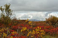
Aytumn symphonyby EgillPComment by bassbone: lovely rich colors - the clouds have so much potential, as does the scene behind the bushes - it just seems that the angle of the shot (low relative to the bushes and scene behind) do not convey deep DOF as well as a higher angle would give |
| Photographer found comment helpful. |
| 09/09/2009 02:45:24 PM |
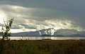
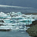
Cool !by EgillPComment by EgillP: Thanks for your commrnts and critique. One thing I feel I have to correct: The edge in the background is not the horizon, but the sloping glacier that feeds the lagoon with ice and if I were to tilt the image so this line were level, the picture would surely look strange. |
| 09/08/2009 09:42:02 PM |
Cool !by EgillPComment by JulietNN: Hi from the Critique Club,
You asked for your shot to have a comment from a member of the Critique Club.
This is certainly a chilly scene!! I like how your blues and whites contrast so brightly against each other. You have a massive tilt going on though in your horizon, this certainly needs to be straighten out as right now it looks like everything is falling off the page or a crop off the top.
In post processing, i would suggest a little saturations of cyan and blues just to bring out a more blue look in the water, the bluer the water the colder it will look with this particular shot.
Good shot |
| Photographer found comment helpful. |
Home -
Challenges -
Community -
League -
Photos -
Cameras -
Lenses -
Learn -
Help -
Terms of Use -
Privacy -
Top ^
DPChallenge, and website content and design, Copyright © 2001-2026 Challenging Technologies, LLC.
All digital photo copyrights belong to the photographers and may not be used without permission.
Current Server Time: 06/21/2026 05:24:51 AM EDT.