| Image |
Comment |
| 12/04/2009 10:12:56 AM |
Cooking 101: Kitchen Basicsby InsomniacComment by HarveyG: Great lighting focus and colours, perhaps a bit dark for some but I think it's ok as it draws my eye to the lit area. I would have raised a bit higher in the frame however. |
 Photographer found comment helpful. Photographer found comment helpful. |
| 12/04/2009 07:47:23 AM |
Cooking 101: Kitchen Basicsby InsomniacComment by paynekj: I like this. The composition is good any my only complaint is that the cleaver has become part of the background, where I feel it would have been better being a little more distinct. |
| Photographer found comment helpful. |
| 12/04/2009 07:15:00 AM |
|
| Photographer found comment helpful. |
| 12/03/2009 08:55:40 PM |
|
| Photographer found comment helpful. |
| 12/02/2009 04:17:15 AM |
|
| Photographer found comment helpful. |
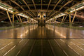
| 11/13/2009 01:10:01 PM |
Ready for take offby InsomniacComment by HarveyG: Reminds me of the X-Wing launch bay of a Star Wars Battleship.
Nice everything, tones, sharpness, lighting, exposure etc.
The lack of carbon based lifeforms is unearthly. WD |
| Photographer found comment helpful. |
| 11/13/2009 07:09:30 AM |
Ready for take offby InsomniacComment by sarampo: I like the leading lines very much, and it actually looks as it will take off, but as an alien ship :)
Very symmetrical all around, and brilliant tones, love the reflections. |
| Photographer found comment helpful. |
| 11/11/2009 01:57:53 PM |
|
| Photographer found comment helpful. |
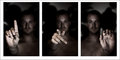
| 11/02/2009 05:04:27 PM |
D P C, can you hear me?by InsomniacComment by macrothing:  Critique Club Critique
First Impressions
Critique Club Critique
First Impressions
Despite the unusual photographic effects created in these captures, I found the images and triptych of them, uninteresting and quite a 'personal study'. I gave this a 3 during voting.
I also had no idea what the sign language was and did not stop to consider it during voting as the main subject was not my personal viewing preference, so I moved on fairly swiftly.
Photograph Information, Technicals & Composition Review
An aperture of 2 explains the good and unusual effect produced, however, it also created a rather dark and 'odd' effect coupled with the lighting and 'shirtless' subject.
The composition itself within each photograph and then placed within a triptych would have been better if the torso was aligned in each image.
Comments, Score & Placement Review
85/145 and a score of 5.56 is not bad, considering the subject matter, which may not have engaged many viewers. An average of 6.88 from your commenters reflects their comments and that most knew the sign language being displayed or knew the intent and either way, liked how you captured it. This just reflects how people view photographs and subject matter differently - just because it isn't something that appeals to me, doesn't mean it won't appeal to others.
Summary
If doing the signs for DPC was your main focus then more attention to distractions that would take attention away from the hands/signs - such as if there is person in the background, whether they are in focus or not, whether they are clothed or not, if so what clothing, the lighting, etc - would have allowed your message to come across much more clearly.
PS
I see this is your first DPChallenge submission - welcome to the 'fun' of entering & voting in Challenges.
Congratulations on taking the plunge, this is a good score and a decent quality photograph for your first submission.
|
| Photographer found comment helpful. |
| 10/25/2009 08:19:15 AM |
|
| Photographer found comment helpful. |
Home -
Challenges -
Community -
League -
Photos -
Cameras -
Lenses -
Learn -
Help -
Terms of Use -
Privacy -
Top ^
DPChallenge, and website content and design, Copyright © 2001-2026 Challenging Technologies, LLC.
All digital photo copyrights belong to the photographers and may not be used without permission.
Current Server Time: 07/16/2026 09:18:01 PM EDT.