| Image |
Comment |
| 01/18/2010 01:01:43 AM |
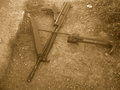
A Better Worldby yiannis723Comment by Yo_Spiff: Well, I'm at least glad to see I could leave you a comment giving you some clue to why it bombed. I hate when I get low voted with no explanation of why. |
 Photographer found comment helpful. Photographer found comment helpful. |
| 01/17/2010 04:25:58 PM |
A Better Worldby yiannis723Comment by Yo_Spiff: I like the idea, but I don't feel the perspective or the sepia tone were the best choice. It just doesn't seem to have any visual impact on me that such a subject should have. Hope that makes some sense. |
| Photographer found comment helpful. |
| 01/17/2010 12:08:19 AM |
|
| Photographer found comment helpful. |
| 01/13/2010 02:33:26 PM |
|
| Photographer found comment helpful. |
| 01/13/2010 09:19:33 AM |
|
| Photographer found comment helpful. |
| 01/11/2010 11:03:59 PM |
|
| Photographer found comment helpful. |
| 01/08/2010 09:12:46 PM |
|
| Photographer found comment helpful. |
| 01/07/2010 09:43:08 PM |
|
| Photographer found comment helpful. |
| 01/06/2010 05:29:11 AM |
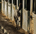
kind careby yiannis723Comment by spiritualspatula: I'm not too sure if I'm correct about this, but the image as a whole feels like it's been contorted. It seems as though the width was decreased without the proper decrease in height to match, squishing everything in. I'd also prefer the DoF to be centered on the horses themselves, not behind, since they are the subjects. |
| Photographer found comment helpful. |
| 01/05/2010 07:50:51 PM |
kind careby yiannis723Comment by littlegett: The dof is way to far back, I see the background in focus but not the two horses. There is so much texture and personality and character possible within this image I just wish it was brought out a bit stronger. |
| Photographer found comment helpful. |
Home -
Challenges -
Community -
League -
Photos -
Cameras -
Lenses -
Learn -
Help -
Terms of Use -
Privacy -
Top ^
DPChallenge, and website content and design, Copyright © 2001-2026 Challenging Technologies, LLC.
All digital photo copyrights belong to the photographers and may not be used without permission.
Current Server Time: 05/05/2026 09:09:43 AM EDT.