| Image |
Comment |
| 10/11/2009 10:48:20 PM |
|
 Photographer found comment helpful. Photographer found comment helpful. |
| 10/11/2009 06:37:39 PM |
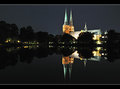
Symmetryby ronaldfwComment by BigJohnson: I keep forgetting to add photos to favorites. You just reminded me. Love how clean and smooth this feels. 10 |
| Photographer found comment helpful. |
| 10/11/2009 05:31:11 PM |
|
| Photographer found comment helpful. |
| 10/11/2009 01:43:05 PM |
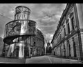
New and Old Architecture IIby ronaldfwComment by ronaldfw: Originally posted by cpanaioti:
Love the BW processing. To me it has more impact than the colour version as the eye is drawn to the architectural detail rather than being distracted by the colour. |
Thank you for your comment. I think I agree to some extend. I felt that the color version I entered (which was shot on a different day, btw) looked more HDR'ish and thus fitted the challenge better. |
| 10/11/2009 12:59:27 PM |
New and Old Architecture IIby ronaldfwComment by cpanaioti: Love the BW processing. To me it has more impact than the colour version as the eye is drawn to the architectural detail rather than being distracted by the colour. |
| Photographer found comment helpful. |
| 10/10/2009 06:02:52 PM |
|
| Photographer found comment helpful. |
| 10/09/2009 03:52:10 PM |
Symmetryby ronaldfwComment by HarveyG: This is really well photographed and titled. Good balance, comp, colours, just a tad blown around some lights, otherwise a great shot. |
| Photographer found comment helpful. |
| 10/09/2009 01:08:05 AM |
Shades of White by ronaldfwComment by dswann: Congrats on the ribbon! Very nice image. I've tried to get something similar, but haven't managed anything as cool as this. |
| Photographer found comment helpful. |
| 10/08/2009 11:54:16 PM |
Symmetryby ronaldfwComment by dustingooding: Meets Challenge: 2 of 3. Maybe a little too bright on the surface of the building. Would rather have had you use more edge highlights to give the shape.
Technical: 2 of 3. My only complaint is that the middle part of the building and the right end of the building lack details, they're pretty overblown. Good use of border and fantastic reflection.
Emotion: 3 of 3. The saturation on the building really brings out its purpose, to be a light to those around it.
Awe: 1 of 1.
What a great shot. Wow. |
| Photographer found comment helpful. |
| 10/08/2009 07:48:04 PM |
|
| Photographer found comment helpful. |
Home -
Challenges -
Community -
League -
Photos -
Cameras -
Lenses -
Learn -
Help -
Terms of Use -
Privacy -
Top ^
DPChallenge, and website content and design, Copyright © 2001-2026 Challenging Technologies, LLC.
All digital photo copyrights belong to the photographers and may not be used without permission.
Current Server Time: 07/17/2026 02:09:03 AM EDT.