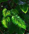
Fall Mulberryby
dr rickComment by Kavey: Critique Club
Composition/ Content
The leaves themselves are pretty, particularly the detail of the veins. However this is offset for me by the lack of any balanced composition and by the post processing.
There is no flow to the arrangement of leaves and no real focal point – instead my eye returns to the bright white circle at the top left. You might consider cropping to a landscape orientation by losing about a quarter of the height from the top and losing a little at the bottom (up to, but not touching, the red tip of the largest leaf). To my eye this strengthens composition considerably and allows you to lose that distracting white circle. It also strengthens the diagonal provided by the central vein of that largest leaf as it now comes from the bottom right corner and leads the eye into the centre and towards the other leaves.
Background
Not of huge interest. I'd be interested to see a version where shallower depth of field throws the background out of focus.
Camera Work - Technical
Lighting seems harsh as it has created some glaring reflections from the leaf surface, which I'm not keen on.
Digital Processing - Technical
Whilst I like vibrant colours this image strikes me as rather over saturated and over sharpened, though perhaps that's actually an effect of the harsh lighting?
Fits The Challenge
N/A
My Opinion On The Photo
Whilst the subject matter holds a little interest this composition and treatment doesn't really display that very strongly for me.
As always, this represents a personal opinion and other CC members may feel very differently about the image.