Bismarck IIby
dr rickComment by sfalice: Greetings from the Critique Club
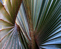
When this image flashed up on my screen to critique, my first thought was "oh, I hope this scored high." Well, it did quite well, but not as well as I thought it would.
Crisp and sharp, super patterns that swirl the viewer around and around, stunning colors, what more could a voter want. Well, your commentors said they wanted a sharper left side. I say, that's nitpicking, but that's the way it goes sometimes.I suppose you could have cropped some of the fuzzier pleats out of the way, which would have made it a different, but still exciting picture. Hard to tell. When I looked at your portfolio, I visited Bismark I and also enjoyed that one. And see that one had a slightly fuzzy side as well. But I sure don't know what you could have done to make either one sharper.
This was spectacular seeing and good execution.
So, about all I can say is I wish it had scored a 6, it came close, and you have some lovely abstracts in your collection.
Continued success in your DPC Challenges.