| Image |
Comment |
| 03/13/2009 02:40:31 PM |
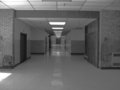
DEEPby jusdavidtinComment by Titia: Nice perspective and symmetry in this photo, but a bit more contrast in the greys wouldn't hurt I think. |
| 03/13/2009 02:38:30 PM |
|
| 03/13/2009 02:36:24 PM |
|
| 03/13/2009 01:59:06 PM |
DEEPby jusdavidtinComment by Steef: it's a good example of lines converging at a vanishing point, and that chair over there to the left makes me wonder about who might sit there, and how that person might hassle or benefit anyone walking by. maybe a slight CCW rotation would straighten everything out? |
| 03/13/2009 11:22:44 AM |
|
| 03/13/2009 11:11:38 AM |
|
| 03/13/2009 10:36:30 AM |
DEEPby jusdavidtinComment by fridjo: too grey, not enough interest to hold the eye. i would enhance contrast and rotated the image a bit to the left, maybe even a tighter crop would work. |
| 03/13/2009 09:24:12 AM |
|
| 03/13/2009 07:56:20 AM |
DEEPby jusdavidtinComment by Denise: I like how the ceiling lights illuminate the floor and create a walkway. |
| 03/13/2009 03:26:20 AM |
|
Home -
Challenges -
Community -
League -
Photos -
Cameras -
Lenses -
Learn -
Help -
Terms of Use -
Privacy -
Top ^
DPChallenge, and website content and design, Copyright © 2001-2026 Challenging Technologies, LLC.
All digital photo copyrights belong to the photographers and may not be used without permission.
Current Server Time: 07/15/2026 07:42:52 PM EDT.