| Image |
Comment |
| 02/01/2006 03:24:29 PM |
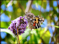
Painted Ladyby GeneralEComment by GeneralE: Originally posted by train:
This looks stunning why didnt you crop it in to gets rid of the distactions of the back ground Its quite hard to focus on the actual image of the flower and butterfly
Detail is great just that background is not |
I have been trying to concentrate on my camera skills and not editing, so I've been submitting a lot of uncropped shots just to see how successful my composition has been. I was actually very happy to achieve the DOF/bokeh effect, as it's hard to do with this camera. I like the riotous colors, though they do provide camouflage, they also mimic/mirror the colors of the subject.
Another consideration is that this is only a 3MP original -- cropping would probably limit me to 5x7 prints, even with a border.
I can try fading the BG to make the butterfly pop out a bit more, and maybe I'll try a vertical crop as well -- thanks for the sugggestion. |
| 01/27/2006 08:21:14 PM |
|
 Photographer found comment helpful. Photographer found comment helpful. |
| 01/27/2006 12:09:33 PM |
|
| Photographer found comment helpful. |
| 01/26/2006 07:51:56 PM |
|
| Photographer found comment helpful. |
| 01/26/2006 08:07:20 AM |
|
| Photographer found comment helpful. |
| 01/25/2006 11:07:38 PM |
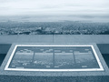
Panorama in 4:3by GeneralEComment by kteach: Originally posted by GeneralE:
Originally posted by kteach:
I'm not sure if I like the overall lack of color since it keeps it consistent with the sign, or if I would like to see more color in the top half. Creative shot and perfect for the challenge. Nicely done. |
There really wasn't any color in the original -- it was a gray,hazy day and this view is at least partly backlit.
At first I tried it in a warm sepia-like look, but though it gave the sky a nice glow, it made the concrete and the sign (the real subject) look a little funny, so I switched to a Black/Cyan duotone for that cooler, foggy look. |
I understand that gray, hazy day stuff, yuck! I can't picture this in sepia tones at all...so this was probably your best choice then. No matter what the colors, I still think it's a cool shot :) |
| Photographer found comment helpful. |
| 01/25/2006 03:54:14 PM |
Panorama in 4:3by GeneralEComment by mycelium: I tried a couple of things to bring out the dynamic range in this image... for Basic Editing, Adding a Channel Mixer at 120/-10/-10 definitely brought out the contrast a bit more; the image could be re-duotoned from that. For Advanced Editing, duplicating the layer, setting to Multiply mode, and adding a white-black-white vertical gradient added a nice sense of richness to the image, and helped out the sky a lot. In both cases I finished up with a USM at 60%, .3 radius, 0 threshold.
I'm another member of the crowd that thinks that this is a good picture and conceptually strong, just not presented quite as well as it might have been. |
| Photographer found comment helpful. |
| 01/25/2006 02:59:11 PM |
Panorama in 4:3by GeneralEComment by Kivet: Well Im not sure HOW to make this better but I can tell you what I would work on. I like the foggy look of the city and the water but the sky needs more contast, it looks like there are hazy clouds there that arent blown and if you could get rid of a little of the brightness there they would stand out. The border of the sign is really bright. I would somehow darken that to make it not so glaring, the agtual sign would stand out more without the competition. I like the color scheme and the detail in the granite. |
| Photographer found comment helpful. |
| 01/25/2006 01:51:53 PM |
|
| Photographer found comment helpful. |
| 01/25/2006 01:50:42 PM |
Panorama in 4:3by GeneralEComment by GeneralE: Originally posted by kteach:
I'm not sure if I like the overall lack of color since it keeps it consistent with the sign, or if I would like to see more color in the top half. Creative shot and perfect for the challenge. Nicely done. |
There really wasn't any color in the original -- it was a gray,hazy day and this view is at least partly backlit.
At first I tried it in a warm sepia-like look, but though it gave the sky a nice glow, it made the concrete and the sign (the real subject) look a little funny, so I switched to a Black/Cyan duotone for that cooler, foggy look. |
Home -
Challenges -
Community -
League -
Photos -
Cameras -
Lenses -
Learn -
Help -
Terms of Use -
Privacy -
Top ^
DPChallenge, and website content and design, Copyright © 2001-2026 Challenging Technologies, LLC.
All digital photo copyrights belong to the photographers and may not be used without permission.
Current Server Time: 05/13/2026 09:07:40 PM EDT.