| Image |
Comment |
| 04/05/2006 01:16:52 AM |
Kaplaby GeneralEComment by GeneralE: Originally posted by facesastheycome:
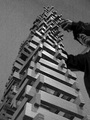
nice idea ,not realy sure about the grain tho i think just B&W wold of done the job |
As I mentioned, the graininess in the BG was intentional, to emphasize the difference between the structure and the surroundings, which are actually very blah otherwise. I "later" thought this might look good in a duotone.
I did get one shot later of blocks tumbling, but there was no "composition" to it. These were shot in a museum, so avoiding other people and exhibits is tricky. This one was composed by "dead reckoning" with the camera lying almost flat on the table -- no using either the LCD or the viewfinder. |
| 04/05/2006 12:59:20 AM |
|
 Photographer found comment helpful. Photographer found comment helpful. |
| 04/05/2006 12:51:37 AM |
|
| 04/04/2006 08:59:42 PM |
Kaplaby GeneralEComment by how03: I like the tension. The perspective distortion adds to the drama. I also like that I can see the face of the builder of the tower. He seems very intent and focused which is good for the picture. The fact that it is b & w is probably a very wise choice with this since it gives you a stronger sense of the repetition with the blocks. There seems to be a fair amount of grain in this, but I don't think it matters too much for this particular shot. The prominent feature of this photo is the face of the tower and other than a nice repetition and good contrast there isn't anything there that keeps my attention. |
| Photographer found comment helpful. |
| 04/04/2006 02:29:09 PM |
|
| Photographer found comment helpful. |
| 04/04/2006 02:07:13 PM |
Kaplaby GeneralEComment by Imagineer: Great viewpoint and composition. Shame there's no action here - like tumbling blocks, but it's still quite strong. |
| Photographer found comment helpful. |
| 04/04/2006 12:07:40 PM |
Kaplaby GeneralEComment by dianiewill: this photo is grainy and looks "over-copied." I love the subject material and the compostion is very good. |
| Photographer found comment helpful. |
| 04/04/2006 11:21:27 AM |
|
| Photographer found comment helpful. |
| 04/03/2006 10:56:08 PM |
|
| Photographer found comment helpful. |
| 04/03/2006 06:10:01 PM |
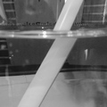
Liquid Lensesby GeneralEComment by macrothing: Left a comment on:
 .
The shot is definitely all about water, which for this Challenge, was a very important factor (always is for me). Liked the angle and the fact this was a macro was also good. Nice capture of the light play on the water overall, in my opinion. |
| Photographer found comment helpful. |
Home -
Challenges -
Community -
League -
Photos -
Cameras -
Lenses -
Learn -
Help -
Terms of Use -
Privacy -
Top ^
DPChallenge, and website content and design, Copyright © 2001-2026 Challenging Technologies, LLC.
All digital photo copyrights belong to the photographers and may not be used without permission.
Current Server Time: 05/14/2026 08:11:34 PM EDT.