| Image |
Comment |
| 02/11/2022 02:03:40 AM |
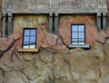
Rustic by GeneralEComment by tnun: I think I have seen this in one of my rare walks through Berkeley. You've showcased the stone, but what I better remember are the dark dark timbers. If this is what I saw. |
 Photographer found comment helpful. Photographer found comment helpful. |
| 02/08/2022 11:56:32 PM |
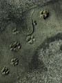
Future Fossilby GeneralEComment by SandyP: I think this is really interesting! I guess we gotta love these harsh voters sometimes anyway tho. |
| Photographer found comment helpful. |
| 02/08/2022 09:49:20 PM |
|
| Photographer found comment helpful. |
| 02/08/2022 01:45:38 AM |
|
| Photographer found comment helpful. |
| 01/29/2022 08:25:38 AM |
|
| Photographer found comment helpful. |
| 01/28/2022 11:16:45 AM |
Anniversaryby GeneralEComment by vawendy: The photo is rather nice, but I guess I don't see what it has to do with Anniversary... I think I'm missing something. |
| Photographer found comment helpful. |
| 01/23/2022 10:14:26 AM |
|
| Photographer found comment helpful. |
| 01/17/2022 11:06:39 AM |
|
| Photographer found comment helpful. |
| 01/17/2022 10:41:55 AM |
|
| Photographer found comment helpful. |
| 01/17/2022 07:32:49 AM |
The Social Fabricby GeneralEComment by kasaba: VERY creative. However, I don't like your post processing and the noise it creates. A pity, because I really think this is an awesome idea. |
| Photographer found comment helpful. |
Home -
Challenges -
Community -
League -
Photos -
Cameras -
Lenses -
Learn -
Help -
Terms of Use -
Privacy -
Top ^
DPChallenge, and website content and design, Copyright © 2001-2026 Challenging Technologies, LLC.
All digital photo copyrights belong to the photographers and may not be used without permission.
Current Server Time: 06/16/2026 06:10:22 PM EDT.