| Image |
Comment |
| 10/07/2002 01:08:00 AM |
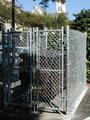
Fort Dumpster, USAby GeneralEComment by Yomi: I wonder how many people are going to ask why this is locked up like this. Guess no one's been dumpster diving :) I don't like the shadow on the side. But funny picture. 6 Jubei |
| 10/07/2002 09:21:00 AM |
|
 Photographer found comment helpful. Photographer found comment helpful. |
| 10/04/2002 11:30:00 PM |
|
| Photographer found comment helpful. |
| 10/03/2002 10:59:00 PM |
|
| Photographer found comment helpful. |
| 10/03/2002 12:25:00 PM |
|
| Photographer found comment helpful. |
| 10/02/2002 04:23:00 PM |
|
| Photographer found comment helpful. |
| 10/02/2002 12:00:00 PM |
Digital Thinker (Hmm...Which One To Submit?)by GeneralEComment by floyd: Great to see a couple of people didn't interpret reflection so literally. Bonus marks from me for thinking outside the box. Your shot is very dark, though. That's a particularly difficult scene to shoot - lots and lots of extra light is needed to balance out the monitor screen and a long exposure is also needed to get a shot of the screen without lines in it. So that means you'll need a small aperture. Tricky to shoot for sure! 7 - floyd |
| Photographer found comment helpful. |
| 10/02/2002 09:58:00 AM |
Digital Thinker (Hmm...Which One To Submit?)by GeneralEComment by jmsetzler: Meets the Challenge: Yes Artistic Merit (Would I print/frame/hang it?): 3 Creativity (Did a lot of thought go into this photo?): 7 Technical (Focus/DOF/Lighting/Etc): 5 Composition (Subject well-positioned and framed): 6 WOW Factor (Is the photo interesting?): 3 Score: 5 - setzler |
| Photographer found comment helpful. |
| 10/02/2002 07:09:00 AM |
|
| Photographer found comment helpful. |
| 10/02/2002 12:59:00 AM |
|
Home -
Challenges -
Community -
League -
Photos -
Cameras -
Lenses -
Learn -
Help -
Terms of Use -
Privacy -
Top ^
DPChallenge, and website content and design, Copyright © 2001-2026 Challenging Technologies, LLC.
All digital photo copyrights belong to the photographers and may not be used without permission.
Current Server Time: 05/05/2026 10:52:09 PM EDT.