| Image |
Comment |
| 09/16/2003 10:01:12 AM |
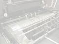
Fading Freedomby GeneralEComment by vonautsch: It's hard to make out what the machine is. This is a good idea, but the rules in the challenge make this very hard to portray. Unfortunately, the outcome gives the appearance of a bad photo. |
 Photographer found comment helpful. Photographer found comment helpful. |
| 09/13/2003 01:49:10 PM |
|
| Photographer found comment helpful. |
| 09/13/2003 02:01:41 AM |
Fading Freedomby GeneralEComment by TooCool: I don't get it....Where is the freedom that is fading??? What is the machinery that we are looking at??? This is a cool name, cool concept (fading away of our freedoms) but don't see freedom here because the subject is an unknown variable... If it was a typewriter or a gun or a bible (church, cross, insert religious symbol here) and all else was equal, 8 or more....this doesn't get that though.
Hope this helps.
TC |
| Photographer found comment helpful. |
| 09/12/2003 10:28:10 PM |
Fading Freedomby GeneralEComment by tfaust: I like the way diagonals are used here and your lighting seems to be right on. Interesting interpretation of "Freedom" :-) |
| Photographer found comment helpful. |
| 09/12/2003 08:27:40 PM |
|
| Photographer found comment helpful. |
| 09/12/2003 04:36:02 PM |
|
| Photographer found comment helpful. |
| 09/12/2003 04:35:18 PM |
|
| Photographer found comment helpful. |
| 09/12/2003 02:41:39 PM |
|
| Photographer found comment helpful. |
| 09/12/2003 07:19:43 AM |
|
| Photographer found comment helpful. |
| 09/12/2003 01:13:01 AM |
Fading Freedomby GeneralEComment by faidoi: This is a very interesting idea. I like it. The angle you used makes the piece very interesting. You can still make out what it is because of the great reflections and shadows you were able to capture. |
| Photographer found comment helpful. |
Home -
Challenges -
Community -
League -
Photos -
Cameras -
Lenses -
Learn -
Help -
Terms of Use -
Privacy -
Top ^
DPChallenge, and website content and design, Copyright © 2001-2026 Challenging Technologies, LLC.
All digital photo copyrights belong to the photographers and may not be used without permission.
Current Server Time: 05/07/2026 11:26:21 PM EDT.