| Image |
Comment |
| 12/13/2003 10:27:56 PM |
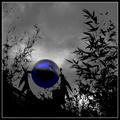
Sphere and Fractalsby GeneralEComment by Dave Gordon: The bright touch of color in the midst of all this black and white gives this photo a three dimensional effect, and makes it jump right off the screen. Great work. |
 Photographer found comment helpful. Photographer found comment helpful. |
| 12/12/2003 10:16:27 PM |
Sphere and Fractalsby GeneralEComment by ursula: Hmmm. Interesting. What in the world is it? This is quite a fastinating picture, and I like the grain in it. Somehow I keep thinking that the reflection on the ball should be upside down from what it is. Weird. |
| Photographer found comment helpful. |
| 12/12/2003 05:01:43 PM |
The Torch Of Freedomby GeneralEComment by GeneralE: Originally posted by TooCool:
Finally, the thing I like best about it is that you tried something totally different from all the other shots I've seen. You showed great originality here. Unfortunately, here if it's new and it ain't dang near perfect, it's not gonna get much of a reception.
TC |
A fine review, and I've decided I can live with the low technical scores, if a few people can see past them to "get" the underlying idea.
Thanks! |
| 12/12/2003 04:06:01 PM |
As Simple As ...by GeneralEComment by piwoguy: I really like the textures in this, but the uneven lighting across the three letters is just sliiiightly distracting. |
| Photographer found comment helpful. |
| 12/12/2003 08:21:25 AM |
The Torch Of Freedomby GeneralEComment by TooCool: From the Critique Club
Things I like: I love what you are trying to say with this shot but have to admit that I didn't get it till after the challenge when I read your comments. I really like the anti-silhouette (for lack of a better term) look of the subject. Good use of negative spacing. I actually kind of like the noise in this shot. Nice balanced compostion within the frame.
Things I don't like: The shot is out of focus. My camera is only a step up from yours and I understand how difficult it can be to focus in the dark. I have the best luck when working with something this dark by focusing with other lights on (just enough light to get the autofocus to lock on) and using the timer to give me time to get the lights back off again. Also the subject is very dark. It needs some kind of fill lighting. I know that you say you tried the onboard flash and believe you when you say it don't look right, but this shot needs more lighting. I might have tried more fire (candles or another torch made the same as the first to duplicate the light temp.) or some kind of reflector. I am having my own lighting issues and can understand how frustrating it can be trying to get it right.
Finally, the thing I like best about it is that you tried something totally different from all the other shots I've seen. You showed great originality here. Unfortunately, here if it's new and it ain't dang near perfect, it's not gonna get much of a reception.
TC |
| Photographer found comment helpful. |
| 12/11/2003 02:04:57 AM |
As Simple As ...by GeneralEComment by nborton: i like the rusted looking background. one improvement would be to get rid of the glare on the first two letters. |
| Photographer found comment helpful. |
| 12/10/2003 05:35:01 PM |
As Simple As ...by GeneralEComment by brianlh: i like the choice of the rusted background, as opposed to the standard white or black - not exactly sure why, because it wouldn't necessarily work with all subjects. maybe it's the contrast of of the bubbly/colorful nature of the letters and the hard/aged look of the background. nice job. |
| Photographer found comment helpful. |
| 12/10/2003 05:30:32 PM |
|
| Photographer found comment helpful. |
| 12/10/2003 03:47:07 PM |
|
| Photographer found comment helpful. |
| 12/10/2003 03:16:50 PM |
|
| Photographer found comment helpful. |
Home -
Challenges -
Community -
League -
Photos -
Cameras -
Lenses -
Learn -
Help -
Terms of Use -
Privacy -
Top ^
DPChallenge, and website content and design, Copyright © 2001-2026 Challenging Technologies, LLC.
All digital photo copyrights belong to the photographers and may not be used without permission.
Current Server Time: 05/08/2026 10:19:13 PM EDT.