| Image |
Comment |
| 12/15/2003 12:24:58 PM |
As Simple As ...by GeneralEComment by zummer: The background is ugly.. mayby a white sheet will be better
I think you used flash.. there is lightreflection..
tripod an no flash is a big help if you want get rid of the reflection. |
 Photographer found comment helpful. Photographer found comment helpful. |
| 12/15/2003 08:20:34 AM |
Slick!by GeneralEComment by Jeileen: Enhancement of the colors would have worked nicely for this picture. A bit flat in color otherwise. Good idea. |
| Photographer found comment helpful. |
| 12/15/2003 07:27:03 AM |
Slick!by GeneralEComment by faidoi: Beautiful colors coming from the oil in the water, it helps to show the flow of the water.I think maybe cropping the left side of the shot would help the composition.
I think this is the most original non-setup shot of the challenge. |
| Photographer found comment helpful. |
| 12/15/2003 12:50:08 AM |
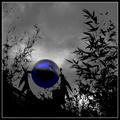
Sphere and Fractalsby GeneralEComment by GeneralE: Originally posted by Rooster:
THIS A GREAT MOODY SHOT! oops! Sorry about the caps |
I think all caps is fine in this case ...
Here's a link to the "original" image before applying the color effect to the sphere. The "Fractals" in the title refers to the bamboo branches and leaves more than to the pattern on the sphere. Overall I was happy with the response, or perhaps the lack of what I expected to be a "Too Digital Art!" response ... Thanks for your comments!
 |
| 12/14/2003 11:26:49 PM |
|
| Photographer found comment helpful. |
| 12/14/2003 09:56:06 PM |
|
| Photographer found comment helpful. |
| 12/14/2003 12:49:16 PM |
As Simple As ...by GeneralEComment by HRoxas: Nice placement of the letters, good colors and lighting. The textured background probably is not the best choice to convey simplicity. |
| Photographer found comment helpful. |
| 12/14/2003 09:58:13 AM |
As Simple As ...by GeneralEComment by Neil: Simple on two planes. A good arrangement too. I think you should have tried to postprocess with neatimage or other two get rid of the "aging" on the surface of the letters. That plus the slight reflections make them look less apealing and detract from the shot. |
| Photographer found comment helpful. |
| 12/14/2003 06:33:25 AM |
As Simple As ...by GeneralEComment by Olyuzi: Excellent concept that I wish was carried out differently, as I do not like this combination of subject and background in regards to color. They seem to clash I do like the way the letters are arranged. Also, it appears the lighjting is uneven and there is too much glare coming off the letters. |
| Photographer found comment helpful. |
| 12/14/2003 02:29:26 AM |
As Simple As ...by GeneralEComment by neenee1999: Great concept, the primary colors are great, and the positioning of the letters give it a simple childlike quality, the only thing I really see wrong here is a small glare, but sometimes that cannot be helped, this is good I like it |
| Photographer found comment helpful. |
Home -
Challenges -
Community -
League -
Photos -
Cameras -
Lenses -
Learn -
Help -
Terms of Use -
Privacy -
Top ^
DPChallenge, and website content and design, Copyright © 2001-2026 Challenging Technologies, LLC.
All digital photo copyrights belong to the photographers and may not be used without permission.
Current Server Time: 05/09/2026 03:05:15 AM EDT.