| Image |
Comment |
| 08/22/2004 12:32:21 AM |
|
 Photographer found comment helpful. Photographer found comment helpful. |
| 08/21/2004 10:14:41 PM |
|
| Photographer found comment helpful. |
| 08/21/2004 10:54:10 AM |
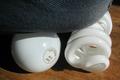
Knee On Lightsby GeneralEComment by claudia26: nice word game idea but the composition is too disparate: the fjeans abric and the floor compete too strongly against the bulbs |
| Photographer found comment helpful. |
| 08/21/2004 01:37:10 AM |
|
| Photographer found comment helpful. |
| 08/20/2004 02:39:09 PM |
|
| Photographer found comment helpful. |
| 08/20/2004 01:05:48 PM |
|
| Photographer found comment helpful. |
| 08/20/2004 12:17:07 PM |
|
| Photographer found comment helpful. |
| 08/19/2004 11:40:19 PM |
Knee On Lightsby GeneralEComment by KiwiChris: The light is a bit harsh, and the shadow to the upper left is a little distracting, but otherwise a great photo. You've got the focus on the lights, and the shallow DOF has the denim just out of focus, really drawing the eye to the glass work.
I might have been tempted to remove the writing from the top of the standard bulb though, as the 'double text' look from the shadow makes it look a little out of focus in that area.
I feel that the picture is slightly 'top heavy' though, possibly a lighter dennim to lighten the top of the frame, or a even a naked knee, which would of course allowed you to enter in two challenges for the price of one. Maybe a white sheet of paper just out of frame on the left to give some fill lighting to the shadows would have worked as well.
I got a giggle out of this, so it deserves a long comment :-). a solid 8. |
| Photographer found comment helpful. |
| 08/19/2004 11:20:44 PM |
|
| Photographer found comment helpful. |
| 08/19/2004 08:32:29 PM |
Knee On Lightsby GeneralEComment by Brad: Didn't "literally" fit the challenge (florescent light on the right),
but do give you credit for your imgaination, wit & title.
Funny one! ((5)) |
| Photographer found comment helpful. |
Home -
Challenges -
Community -
League -
Photos -
Cameras -
Lenses -
Learn -
Help -
Terms of Use -
Privacy -
Top ^
DPChallenge, and website content and design, Copyright © 2001-2026 Challenging Technologies, LLC.
All digital photo copyrights belong to the photographers and may not be used without permission.
Current Server Time: 05/10/2026 01:55:54 PM EDT.