| Image |
Comment |
| 06/24/2009 12:27:09 AM |
|
 Photographer found comment helpful. Photographer found comment helpful. |
| 06/06/2009 09:58:08 AM |
|
| Photographer found comment helpful. |
| 05/27/2009 04:55:29 AM |
|
| 05/23/2009 01:44:17 PM |
|
| Photographer found comment helpful. |
| 05/20/2009 01:35:05 PM |
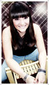
Glamorous Smileby MarikaComment by glad2badad: Yes, a very pretty smile. The starburst pattern in the background is interesting. I can't help but wonder how this would have done more dressed up (using this bg) instead of jeans and a wooden chair, using slacks or tights and a chrome chair. Just thinking out loud. Anyway, good luck. |
| Photographer found comment helpful. |
| 05/18/2009 07:03:33 PM |
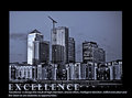
Excellenceby MarikaComment by scottieham: Good idea and nice composition. My only complaint is I do not like the how "Excellence" overlaps the image. It keeps it from standing out. |
| Photographer found comment helpful. |
| 05/17/2009 03:20:53 PM |
Excellenceby MarikaComment by SEG: Very nice shot but I wish the word "excellence" was not over the actual picture. Makes it a little harder to read. |
| Photographer found comment helpful. |
| 05/15/2009 05:28:13 AM |
Excellenceby MarikaComment by fitz3000: the text goes into the photo, and what's worse the color of the photo and the text that goes into it are same, and that's not good...I wish you refered to your motivational message when you were editing this photo |
| Photographer found comment helpful. |
| 05/15/2009 02:56:31 AM |
Excellenceby MarikaComment by kaiser_chief: The image works well with the saying. however you needed to have a larger area at the bottom so that the text does not sit over the image. For me, the writing and the lower lights are fighting, and it doesn't work. Also, I would prefer the words to be centre aligned, and not to the left.
The colour in the city is good, the crane is perfect for this, adds to the image and makes the statement. I like the image and the processing you have done, the exposure is good. With changes to the presentation, this could have been a very high scoring submission |
| Photographer found comment helpful. |
| 05/14/2009 04:38:40 PM |
Excellenceby MarikaComment by AmeedEl-Ghoul: The only reason I am not giving it 10 is the way the text is overlapping the picture, Some tonal range makes it distracting to me, 6 |
| Photographer found comment helpful. |
Home -
Challenges -
Community -
League -
Photos -
Cameras -
Lenses -
Learn -
Help -
Terms of Use -
Privacy -
Top ^
DPChallenge, and website content and design, Copyright © 2001-2026 Challenging Technologies, LLC.
All digital photo copyrights belong to the photographers and may not be used without permission.
Current Server Time: 07/17/2026 06:22:44 AM EDT.