Zombieby
moviemanComment by mirdonamy: I saw your thread on "freaking hypocrits" post and i wanted to offer you my critique to maybe help you out a little.
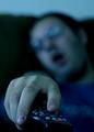
Composition: it works well, but could be cropped a tiny bit tighter on the top and a little looser on the bottom
Color: way too blue. I would say you should warm this up a bit for a more natural look
Focus: the fingers are clear in some locations (i see one pretty clear finger nail) and a few buttons on the remote are clear, but not enough clarity in the image. The DOF is fine for the face and body, but the hand and remote should be in more focus I would prefer
Lighting: it's a tad bit dark. Esp in bottom left and behind the ear of the person.
Contrast: could use a tiny step up
Communication: TV is communication so you meet the goal
Intrigue: It's really not that interesting to me, personally. It gets the point across, but I don't particularly feel drawn to it when looking at 50 pictures around it. It doesn't catch me and draw me in.
I hope this helps you!
Best to you!!!