| Image |
Comment |
| 09/21/2005 08:18:51 PM |
|
 Photographer found comment helpful. Photographer found comment helpful. |
| 09/21/2005 03:20:31 PM |
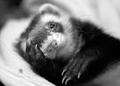
Untitled Nudeby moviemanComment by Jutilda: I have to up the score just for the title and more for the pose. LOL Wish it weren't so blurred. You need to cropt out part of the left so that his eye is at the intersection of the perpendicular and horizontal third lines. |
| Photographer found comment helpful. |
| 09/21/2005 11:21:31 AM |
|
| Photographer found comment helpful. |
| 09/15/2005 01:10:02 AM |
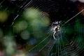
Humpty Dumptyby moviemanComment by brianlh: Thought I'm not certain, this photo looks somewhat backlit, creating a good contrast between the web and the background (though this might not have fit everyone's definition of HC).
Unfortunately, the harsh lighting also seems to blow out some detail on the spider. That, combined with the fact that the focus doesn't look quite spot on (or it the lens just soft?) probably contributed to the lowish score that you received. The composition and interest are there, but the lighting wasn't particularly in your favor. Still a good effort, and better luck next time :)
- Critique Club |
| Photographer found comment helpful. |
| 09/11/2005 02:28:16 PM |
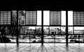
Through the Windowsby moviemanComment by CEJ: The perspective here makes this shot work very nicely. The black and white is perfect for the shot as well. Very nice capture. |
| Photographer found comment helpful. |
| 09/11/2005 01:15:01 AM |
Humpty Dumptyby moviemanComment by Tammer: For me, the soft background detracts from the overall "high contrast." Interesting markings on the spider though. |
| Photographer found comment helpful. |
| 09/10/2005 08:12:21 PM |
|
| Photographer found comment helpful. |
| 09/10/2005 07:28:04 AM |
|
| Photographer found comment helpful. |
| 09/10/2005 02:55:35 AM |
Humpty Dumptyby moviemanComment by scales: Nice shot although I feel the contrast of light and dark on the spider itself is a bit too much - makes the outline harder to make out. |
| Photographer found comment helpful. |
| 09/10/2005 01:14:02 AM |
Through the Windowsby moviemanComment by rasdub: This is a cool shot. I love all the geometric shapes and the perfectly centered 'v' of that the tiles make toward the wall. Great symetry and choice of B&W. |
| Photographer found comment helpful. |
Home -
Challenges -
Community -
League -
Photos -
Cameras -
Lenses -
Learn -
Help -
Terms of Use -
Privacy -
Top ^
DPChallenge, and website content and design, Copyright © 2001-2026 Challenging Technologies, LLC.
All digital photo copyrights belong to the photographers and may not be used without permission.
Current Server Time: 07/22/2026 07:13:25 PM EDT.