DPChallenge: A Digital Photography Contest You are not logged in. (log in or register
 
Browse Settings
Currently viewing:
Registered Usermovieman

Show comments:

Per page:

Order:

Comments:


Comments Received by movieman
Pages:   ... ... [138]
Showing 441 - 450 of ~1377
Image Comment
1/2 a Man
04/29/2006 07:44:34 PM
1/2 a Man
by movieman

Comment by 2mccs:
Interesting idea. I like the black and white
Photographer found comment helpful.
.
04/29/2006 02:31:11 PM
.
by movieman

Comment by Artyste:
Hello, and greetings from the Critique Club. What follows is my best attempt to Critique this photo from a DPC voter's point of view. I'll do my best, but please excuse any comments that may be unintentionally rude or insulting.

Initial Thoughts

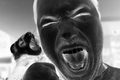
A little too close in. For studio portraits, I expect people are looking to see more studio, and less "person", if you know what I mean

Composition/Content

Nice composition, although suffers from being neither close enough in, or far enough out, IMO. The head covering is a neat idea, but for some reason doesn't really add anything in this instance. Eyes are great, but lack that extra something.

Background

N/A

Camera Work/Technical

Decent camera work, but your lighting is a little too flat. Not enough shadows, texture, or dynamics there to really set anything apart or bring it out.

Digital Processing

Some good work, but I think more attention payed to bringing out the eyes, and darkening the areas around them might have pushed your score up. Voters love that "dragan" look, and getting a shot like this closer to that look would have helped dramatically.

Fits the Challenge

Iffy on this one. As I said, I think voters were expecting to see more of a studio environment as well as the model, so you might have been hit for that. So it fits the challenge *technically*, but misses the mark because of the lack of showing the environment.

My Opinion of the Photo

A nicely done close-up that just lacks the punch to make me really care about the photo.
Photographer found comment helpful.
1/2 a Man
04/29/2006 12:23:09 PM
1/2 a Man
by movieman

Comment by dolphnz8:
Like the crop, the title and the black and white concept, however, the blownout background is a bit too distracting for me. The cut out wood, writing on the wall are important in this shot, yet, I'm too drawn away from those points.
Photographer found comment helpful.
1/2 a Man
04/29/2006 12:06:55 PM
1/2 a Man
by movieman

Comment by OBreaux1:
I like the contrast going on. Very defining.
Photographer found comment helpful.
1/2 a Man
04/29/2006 11:35:51 AM
1/2 a Man
by movieman

Comment by Konador:
I really like the high contrast, but I think the background is slightly too over-exposed.
Photographer found comment helpful.
Rock and Roll
04/29/2006 11:32:18 AM
Rock and Roll
by movieman

Comment by LalliSig:
Pity the eyes are so closed, I find it hard to relate to the subject without them.
Photographer found comment helpful.
1/2 a Man
04/29/2006 05:38:49 AM
1/2 a Man
by movieman

Comment by Zoomdak:
Love the high key approach you got here!
Photographer found comment helpful.
1/2 a Man
04/28/2006 06:02:19 PM
1/2 a Man
by movieman

Comment by Gunnsi:
Or, a Man and a half :-)
Nice idea and capture. The background a bit to bright though.
Photographer found comment helpful.
Rock and Roll
04/28/2006 04:19:20 PM
Rock and Roll
by movieman

Comment by yanko:
LOL. Is it trained to do that?
Rock and Roll
04/28/2006 12:40:11 AM
Rock and Roll
by movieman

Comment by OdysseyF22:
Is that a ferret? Strange image, but it made me look twice and study it a bit. Not bad at all. 7
Photographer found comment helpful.
Pages:   ... ... [138]
Showing 441 - 450 of ~1377


Home - Challenges - Community - League - Photos - Cameras - Lenses - Learn - Help - Terms of Use - Privacy - Top ^
DPChallenge, and website content and design, Copyright © 2001-2025 Challenging Technologies, LLC.
All digital photo copyrights belong to the photographers and may not be used without permission.
Current Server Time: 06/19/2025 07:49:49 AM EDT.