| Image |
Comment |
| 07/28/2004 12:15:56 PM |
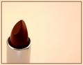
Lipstickby Faye PekasComment by moodville: The first thing I think is 'wrong white balance' due to the white background having a significant yellow cast. It's actually fairly complimentary to the warm red of the lipstick but I guess the photographer in me keeps thinking 'wrong white balance'. The light on the rim of the holder is good and it is also nicely sharp there, but the actual lipstick seems a little soft or slightly out of focus. It has also a slight perspective tilt that makes it appear a little non-straight. I like the use of negative space and the composition is good. |
 Photographer found comment helpful. Photographer found comment helpful. |
| 07/28/2004 10:35:58 AM |
Lipstickby Faye PekasComment by joebok: I like the color and the composition - I wish the tip of the lipstick was sharper. |
| Photographer found comment helpful. |
| 07/28/2004 10:23:26 AM |
|
| Photographer found comment helpful. |
| 07/28/2004 09:23:20 AM |
|
| Photographer found comment helpful. |
| 07/28/2004 03:39:40 AM |
Lipstickby Faye PekasComment by ScantyNebula: I like the composition and the colors and this *could have been a great shot if only the lipstick were in focus! Almost, but not quite! |
| Photographer found comment helpful. |
| 07/28/2004 12:18:33 AM |
|
| Photographer found comment helpful. |
| 07/27/2004 11:55:07 PM |
Dipping Chocolateby Faye PekasComment by dacrazyrn: Nice focus and DOF. Good smooth texture on the chocolate. the focus seems to get a little soft near the crest of (closest part) strawberry and plays a little trick on my eye. Expect to see that area in sharper focus like the other parts around the strawberry. |
| 07/27/2004 08:30:24 PM |
|
| Photographer found comment helpful. |
| 07/27/2004 03:31:21 PM |
|
| Photographer found comment helpful. |
| 07/27/2004 10:43:31 AM |
|
| Photographer found comment helpful. |
Home -
Challenges -
Community -
League -
Photos -
Cameras -
Lenses -
Learn -
Help -
Terms of Use -
Privacy -
Top ^
DPChallenge, and website content and design, Copyright © 2001-2026 Challenging Technologies, LLC.
All digital photo copyrights belong to the photographers and may not be used without permission.
Current Server Time: 07/17/2026 02:52:50 AM EDT.