| Image |
Comment |
| 04/06/2009 12:00:22 PM |
|
 Photographer found comment helpful. Photographer found comment helpful. |
| 04/06/2009 11:47:00 AM |
|
| Photographer found comment helpful. |
| 04/06/2009 09:48:39 AM |
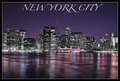
The City That Never Sleepsby Dano6Comment by KarenNfld: Did you desaturate the buildings? They look odd. If you did desaturate them, why? I like your font/text and the photo overall looks good except for the desaturated looking buildings. |
| Photographer found comment helpful. |
| 04/06/2009 09:32:16 AM |
The City That Never Sleepsby Dano6Comment by michaelmonn: id like to see what it looks like without selective desaturation. also the red light atop the empire state building takes away from that desaturation. last but not least the sky looks a little bit noisy but thats a minor thing |
| Photographer found comment helpful. |
| 04/06/2009 09:20:10 AM |
|
| Photographer found comment helpful. |
| 04/06/2009 07:41:35 AM |
|
| Photographer found comment helpful. |
| 04/06/2009 03:23:25 AM |
The City That Never Sleepsby Dano6Comment by RulerZigzag: Nice job at achieving a strong Contrast. Not only are the colors great, but look better contrasted against the B/W cityscape. Center composition is a great choice here, just enough sky and water. The Font is excellent for NYC, reminds me of the font used for New York Magazine. My one gripe is the tonal range on the buildings, its lacking a bit in tonal range. |
| Photographer found comment helpful. |
| 04/04/2009 04:53:52 PM |
|
| Photographer found comment helpful. |
| 04/02/2009 07:50:03 PM |
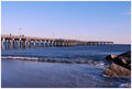
The Ocean - Led Zeppelinby Dano6Comment by Skip: sorry, but boring composition, especially splitting the image in the middle. could have used either some serious foreground or some sky. or you could have waited for a bird (or even brought some bread to attract some birds). as is, just boring. |
| Photographer found comment helpful. |
| 04/01/2009 10:09:05 PM |
|
| Photographer found comment helpful. |
Home -
Challenges -
Community -
League -
Photos -
Cameras -
Lenses -
Learn -
Help -
Terms of Use -
Privacy -
Top ^
DPChallenge, and website content and design, Copyright © 2001-2026 Challenging Technologies, LLC.
All digital photo copyrights belong to the photographers and may not be used without permission.
Current Server Time: 07/17/2026 03:34:17 AM EDT.