| Image |
Comment |
| 01/23/2003 07:06:56 PM |
|
 Photographer found comment helpful. Photographer found comment helpful. |
| 01/23/2003 12:00:28 AM |
Virginia Historical Markerby BAMartinComment by Lustre: Where was this photo taken? It looks more like a coin than a historical marker - is it preserved in a museum or something? Unfortunately, being taken so close it loses its context as a road sign. Your focus is quite good, although I'm not sure why you have cropped it unevenly (perhaps to hide objects beside it?). |
| Photographer found comment helpful. |
| 01/21/2003 11:36:13 PM |
|
| Photographer found comment helpful. |
| 01/21/2003 04:25:20 PM |
Virginia Historical Markerby BAMartinComment by Swashbuckler: Nice angle, very clear shot. The wear on the sign did make me wonder a bit about the photo quality, but it's the sign....IMO, too close. I want to see at least the whole pattern, if not the whole sign (looks like a wonderful blue background behind the sign, was there something we're not seeing that was really bad?) I can't decide if that's glare on the sign (esp. the staff and foot bindings) or if that's wear on the sign. (let's call it wear, O.K?) 7 Swash |
| Photographer found comment helpful. |
| 01/20/2003 11:20:09 PM |
|
| 01/20/2003 07:35:41 PM |
|
| 01/20/2003 11:12:54 AM |
|
| 12/29/2002 09:27:15 PM |
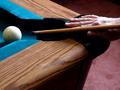
Steady Handsby BAMartinComment by PTLParsons: Really nice photo. The tip of the cue stick is a little out of focus, but the rest is right on. Biggest problem is the challenge is "body parts" and the hand is the lest thing in the photo. The hand should be the focal point, not just stuck in on the side, occupying less than 1/10 of the photo. Better photo than challenge meeting. I hope you can understand what I mean. For the challenge I'd have to give it a 4. In another challenge it would be an 8 or 9. PTL |
| Photographer found comment helpful. |
| 12/28/2002 06:09:11 PM |
|
| Photographer found comment helpful. |
| 12/27/2002 12:44:07 AM |
Steady Handsby BAMartinComment by lisae: I like the motion in this shot. The composition is a bit busy though, and the hand isn't emphasised enough. A closeup, with a different angle to fit the hand, cue and ball in the shot, would have been more interesting. |
| Photographer found comment helpful. |
Home -
Challenges -
Community -
League -
Photos -
Cameras -
Lenses -
Learn -
Help -
Terms of Use -
Privacy -
Top ^
DPChallenge, and website content and design, Copyright © 2001-2026 Challenging Technologies, LLC.
All digital photo copyrights belong to the photographers and may not be used without permission.
Current Server Time: 06/24/2026 12:11:24 AM EDT.