| Image |
Comment |
| 01/31/2004 10:23:15 PM |
|
 Photographer found comment helpful. Photographer found comment helpful. |
| 01/31/2004 12:25:23 PM |
|
| 01/31/2004 08:35:26 AM |
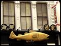
Pisces Eateryby BAMartinComment by nephrotic: Good fish -
I found the picture very cluttered though and feel some of the problems could have been solved with judicous cropping and slight rotation.
There are a couple of ways of "treating this picture - Severely cropping it leaving just the fish and 2 of the chinese characters - or leaving it in its environment and careful cropping and a little rotation.
I find my eye is drawn to the tops of the windows. On the left the top of the frame has cut right into the window - on the right the frame is about six inches above the top of the window. Simply rotating the picture to get rid of that leaves the fish at an angle therefore that would be just as bad - but cropping to just below the window tops - and rotating just one or 2 degrees evens it out a lot.
Because the fish does appear dead straight to the bottom of the frame, I think the only way to fix this properly would have been to move your position slightly to the right (not always possible of course).
On the whole I think a simple crop - half-way across (just below the central window bars may have suited best.
David
|
| Photographer found comment helpful. |
| 01/28/2004 04:45:46 PM |
Pisces Eateryby BAMartinComment by justine: Nice find. I think the bottom could use a tighter crop. The white from the awning is distracting. Good entry. |
| Photographer found comment helpful. |
| 01/28/2004 11:08:37 AM |
|
| 01/28/2004 02:54:52 AM |
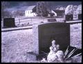
Power of Lightby BAMartinComment by cshep: Nice shot. The table in the bottom right is a little distracting. I wonder if cropping out the bottom a bit might work better? Again, nice job! |
| Photographer found comment helpful. |
| 01/27/2004 10:15:12 PM |
|
| Photographer found comment helpful. |
| 01/26/2004 09:23:51 PM |
|
| Photographer found comment helpful. |
| 01/26/2004 12:55:50 AM |
|
| Photographer found comment helpful. |
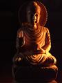
| 11/20/2003 03:14:29 AM |
Sacred Resting Placeby BAMartinComment by amazoneea: Greetings from The Critique Club
This photo is really good. Beautiful panorama. The light is soft. You have taken the picture at the good time. The black and white gives a beautiful atmosphere. The blue makes it surreal. The first plan pops out of the whole as the background scene makes the perfect frame for a subject.
The light and the mood are perfect for the scene. I think you have cropped it well, it gives the image extra depth, and it feels like one is drawn in to the picture. I love the siluetted trees. I also love the fence. It looks like it is dividing two worlds. I think you have succeded not to make this picture a cliché, partly by selecting B&W and adding the purple-blue tint. I do not see anything I would like to change. Maybe the final score.
Keep up the good work. Was an honor to critique your photo.
Best regards,
Elena
|
| Photographer found comment helpful. |
Home -
Challenges -
Community -
League -
Photos -
Cameras -
Lenses -
Learn -
Help -
Terms of Use -
Privacy -
Top ^
DPChallenge, and website content and design, Copyright © 2001-2026 Challenging Technologies, LLC.
All digital photo copyrights belong to the photographers and may not be used without permission.
Current Server Time: 06/25/2026 09:53:48 AM EDT.