| Image |
Comment |
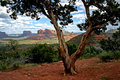
| 03/19/2007 09:14:21 PM |
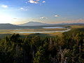
Lakesby BAMartinComment by shalrath: I love the colours in this and even though the sun is blown (try to avoid including the sun if you can) it still feels like a strong image.
I think that the bottom half of the image being filled with brush doesn't really add a lot to the image, I wonder what it would look like in more of a panoramic crop, losing most of the bottom half. |
 Photographer found comment helpful. Photographer found comment helpful. |
| 03/19/2007 08:53:32 PM |
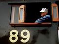
retiredby BAMartinComment by MelonMusketeer: The light gradient from low at the left to high at the right shows off the old engine nicely. Too bad no one has the time and money to build a shed over these old relics. It looks like this one was doing government work when it was finally side-lined. |
| Photographer found comment helpful. |
| 03/19/2007 08:05:33 PM |
Conductorby BAMartinComment by MelonMusketeer: Good capture of a scene that seems to combine all the elements in it very nicely. If you like rail roads you just have to like this image. The conductor looks the part, like a book character. |
| Photographer found comment helpful. |
| 03/19/2007 04:08:55 PM |
|
| Photographer found comment helpful. |
| 03/19/2007 01:06:27 PM |
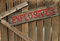
Explosivesby BAMartinComment by Artifacts: Positives:
Technicals generally are good. Appriopriate subject and very well framed. This is nice image. Lots to like about it. It is better than it's score.
Technicals:
Color, composition, overall exposure, brightness and framing are all excellent. Your unique application of the rule of thirds in this composition is superb. Really, really nice texture. You paid close attention to the framing and it shows up nicely.
You have some digital "jaggies" on the angle lines of the 'explosives' sign that holds this image back, otherwise the sharpness is great.
The challenge:
Meets the challenge in a very creative and direct way both in color and content. Unfortunately, it looks like the concept of danger as red was above the heads of voters and you suffered because there was less 'red' in it than they expected.
Suggestions:
This is an excellent image. It's sharpess is fine except for the digital 'jaggies' that hurt this image more technically than anything else. I would recommend this sharpening strategy...
At the end, duplicate your flattened unsharpened layer and apply exactly the same sharpening to that layer that you did before. Then add a layer mask to that layer and brush with a feathered black brush on the mask to reduce sharpening on the 'jaggie' edges to mitigate their digital effect. An alternative might be to use the blur tool to soften the edge slightly PRIOR to sharpening and/or a combination of both. |
| Photographer found comment helpful. |
| 03/19/2007 09:58:13 AM |
|
| Photographer found comment helpful. |
| 03/18/2007 08:19:03 PM |
|
| Photographer found comment helpful. |
| 03/16/2007 03:13:16 PM |
|
| Photographer found comment helpful. |
| 03/16/2007 02:10:43 PM |
Tongueby BAMartinComment by sacredspirit: This is so cute! Yes, I love the update. It definately has more pizazz now, it pops out quite a bit more. |
| Photographer found comment helpful. |
| 03/15/2007 07:52:08 PM |
Leaf.jpgby BAMartinComment by Wink: Hard to resist these warm, earthy, organic tones. There's such a richness to simple, natural objects. |
| Photographer found comment helpful. |
Home -
Challenges -
Community -
League -
Photos -
Cameras -
Lenses -
Learn -
Help -
Terms of Use -
Privacy -
Top ^
DPChallenge, and website content and design, Copyright © 2001-2026 Challenging Technologies, LLC.
All digital photo copyrights belong to the photographers and may not be used without permission.
Current Server Time: 07/16/2026 11:09:11 PM EDT.