| Image |
Comment |
| 04/20/2004 08:59:18 PM |
|
| 04/19/2004 11:01:37 PM |
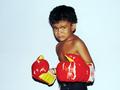
Junior Tysonby surajbharComment by Shelley: Cute. I would have liked this better if cropped vertically. There is too much space on the sides and it takes away from the interest of the picture. Also moving him a little further away from the wall ould have eliminated some of the harsh shadows |
| 04/18/2004 12:33:57 PM |
|
| 04/18/2004 05:46:58 AM |
|
| 04/17/2004 10:49:17 PM |
Junior Tysonby surajbharComment by dccloss: This is cute! But, I am not a fan of the shadows from a flash. Maybe if you put him against a darker background, or a patterned background, to eliminate those harsh shadows, that white background is almost swallowing up your model. Other than that, good job. |
| 04/17/2004 01:22:52 AM |
|
| 04/15/2004 04:15:03 PM |
Junior Tysonby surajbharComment by piwoguy: This is a really great image. The one thing I don't like is all the negative space to the right and left. That's the only thing making it not score in the very top for me. |
| 04/15/2004 03:17:56 PM |
Junior Tysonby surajbharComment by beckettboots: I liked the subject and he's got a wonderful expression, but I'd like to see a softer flash or different background, it's a bit overexposed on the gloves and his eyes should be better in focus |
| 04/15/2004 12:41:31 AM |
|
| 04/14/2004 06:40:20 PM |
|
Home -
Challenges -
Community -
League -
Photos -
Cameras -
Lenses -
Learn -
Help -
Terms of Use -
Privacy -
Top ^
DPChallenge, and website content and design, Copyright © 2001-2026 Challenging Technologies, LLC.
All digital photo copyrights belong to the photographers and may not be used without permission.
Current Server Time: 07/16/2026 02:15:14 PM EDT.